Quantcast
Channel: Art/lit/music/film – Arnold Zwicky's Blog
Viewing all 102 articles
Browse latest View live

Antonio Frasconi

$
0
0

(About art, not language.)

NYT death notice (by Douglas Martin) for Antonio Frasconi (in print in the Art & Design section on the 22nd, in the general obits yesterday):

Antonio Frasconi, Woodcut Master, Dies at 93

In 1953, Time magazine called Antonio Frasconi America’s foremost practitioner of the ancient art of the woodcut. Four decades later, Art Journal called him the best of his generation.

Mr. Frasconi did not reach this pinnacle by adhering to orthodoxies. He found inspiration in comic books as well as the old masters. He decried art education, saying the average student does not learn the pertinent questions, much less the answers. He abhorred art that dwelt on aesthetics at the expense of social problems. He repeatedly addressed war, racism and poverty, and devoted a decade to completing a series of woodcut portraits of people who were tortured and killed under a rightist military dictatorship in his home country, Uruguay, from 1973 to 1985.

A remarkable woodcut of 1955, “What a Shout! Ben Harding”:

More from the obit:

Mr. Frasconi was patient and meticulous in his art, which involves making an impression on paper from a design carved in a block of wood. Before producing a woodcut titled “Sunrise — Fulton Fish Market” in 1953, he spent three months wandering Lower Manhattan’s wharves and the holds of fishing boats. He spent hour upon hour studying “just how a man lifts a box,” he said.

He then spent three weeks carving five wood blocks, each to apply a different color, as they are stamped successively on the same sheet of paper. He said the capricious nature of wood governed many artistic decisions. He loved the hands-on experience of working with wood, some of which he gathered from the beach in front of his home.

… Some of Mr. Frasconi’s work was devilishly playful. His 1952 book, “The World Upside Down,” pictured a bull butchering a human, a man in a bird cage while a bird cavorts outside, and a sheep herding a flock of humans. A dog sleeps in bed, while a man slumbers in a doghouse on the floor. A fire hydrant is nearby, apparently in case the man needs it.

A 1958 version of the Fulton Fish Market piece:

And the 1952 “The Butcher (my turn)”:

Frasconi deliberately chose mostly tough subjects (though he did do illustrations for children) and a demanding art form. Some artists are like that.


Surrealists

$
0
0

(Mostly about art.)

In the current New York Review of Books (4/4/13), a piece by Sanford Schwartz, “Surrealism Made Fresh”, on the exhibition “Drawing Surrealism” (organized by the Los Angeles County Museum of Art, where it showed 10/21/12 through 1/6/13), now at the Morgan Library and Museum in New York (1/25/13 through 4/21/13). It sounds fabulous.

From the LACMA website:

Drawing Surrealism explores the significance of drawing and works on paper to surrealist innovation. Long considered the medium of exploration and innovation, drawing was set free from its associations with other media and valued as a predominant means of expression and innovation with the advent of surrealism. Automatic drawings, exquisite cadavers, decalcomania, frottage, and collage, for example, are just a few of the processes invented by surrealists as means to tap into the subconscious realm.

The exhibition examines the impact of surrealist drawing on a global scale, with approximately 200 works representing 90 artists from 16 countries. Drawing today is in many ways indebted to the expansive and innovative approach to artistic creation and the primacy of drawing encouraged by surrealism. For contemporary artists, drawing is a process more than a medium; it functions as a metaphor for experimentation and innovation that defies any strict material definition. The inclusion of drawing-based projects by contemporary artists Alexandra Grant, Mark Licari, and Stas Orlovski, conceived specifically for the exhibition, aims to elucidate the diverse and enduring vestiges of surrealist drawing.

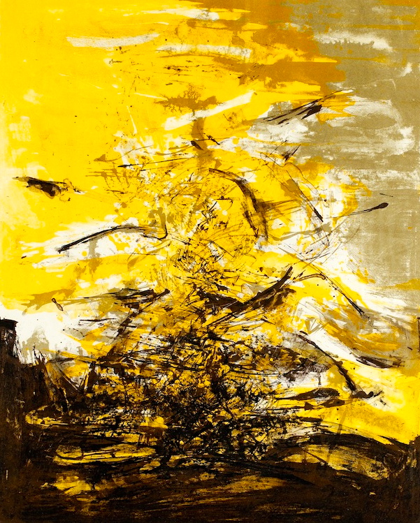
Two drawings from the show. Francis Picabia’s Olga (1930):


and Salvador Dali’s Study for ‘The Image Disappears’ (1938):

Schwartz’s piece begins:

“Drawing Surrealism” is an exhibition that puts us in two minds, which befits an art movement that sought the release of unconscious drives. The Morgan Library and Museum’s show, organized with the Los Angeles County Museum of Art, is one of the few major efforts ever to look at the wide range of drawings, collages, and other kinds of work on paper done both by well-known associates of Surrealism such as Joan Miró, Salvador Dalí, Max Ernst, and René Magritte and by the many other artists and writers drawn to the movement at the time. Including pictures made by figures from Eastern Europe, the Americas, England, and Japan, it is a jampacked, illuminating, and lavishly engaging event. Even before getting close to the drawings, which were made primarily from the middle of the 1920s into the 1940s, one is given the pleasure, simply in walking into the galleries at the Morgan, of seeing many smallish Surrealist works, sporting frames of every description, hung—as if in the living room of a knowing collector—in invitingly rhythmic ways.

… where Dada flippantly said nothing mattered, Surrealism sought to find, foster, and celebrate precisely the impulses that traditional or generally accepted thinking seemingly said had no place at the table. It was after instinctive, irrational awarenesses, which might come from dreams, or from accepting results derived by chance—or from a receptivity to what is taboo—that could shake up and alter our sense of everyday reality.

There’s a language aspect to the story:

Surrealism was in good measure the brainchild of André Breton, who had initially studied medicine and worked in psychiatric wards during the war. It was his background as a scientist of sorts that helped give the movement its character of an ever-changing, and always carefully monitored, experiment in living. Breton embodied a paradox of Surrealism. His role was to instigate and welcome the spontaneous, the illogical, and the inexplicable. His goal, it would seem, was to extend personal liberty. Yet he was a born guru and organizer with a flair for holding meetings, getting out position papers, marshaling his cohorts, and banishing the insubordinate. His efforts helped make Surrealism, as much as any movement of any era, a group endeavor.

Breton and his associates at times worked jointly on writing poems and, eventually, in making drawings. As Mary Ann Caws notes in her Surrealism (2004), a helpful compendium of artworks and writings related to the movement, group activities included “sleep séances to induce automatic speech while in a trance.” There were even meetings every day at six in the same café (they always lasted an hour and a half), and in the early 1930s everyone drank the same drink. (It was different in the winter and the summer.) The collective spirit didn’t, however, attest only to Breton’s need to control. Surrealism shared with Dada a desire to dispense with vaunted notions of authorship—with the aura, in the arts, surrounding training and mastery, uniqueness and the special, personal touch. These qualities were seen as components of the egotism that produced the war.

And then to drawing:

Although we may think that some of the deeper contributions of Surrealism are the paintings of Miró, Magritte, Dalí, and others, painting in itself was initially something of the enemy for many of the Surrealist (and Dada) artists. For figures who tended to be left-wing in their politics, oils on canvas were objects that all too easily could be seen as trophies of capitalism. Drawings, on the other hand, or anything done on paper, set down with any materials that were near to hand, suited a movement that in the beginning attracted writers as much as visual artists and that, opposed to artistic virtuosity for its own sake, saw in works on paper a way for anyone, trained or not, to record at the moment whatever was bubbling up from within.

On particular artists:

The collages by Ernst on view at the Morgan are merely all right. But he isn’t exactly missed, because there are a number of engaging and unfamiliar works on hand that are indebted to him. The Chilean painter Roberto Matta, for example, known for his enormous canvases showing planets or asteroids held in suspension, is seen here in a winning photocollage from 1936 with the very Surrealist title Wet Sheets. It presents the outer-space world he was always creating but minus the gauzily synthetic colors and textures that so often make his paintings less powerful than they ought to be.

… But probably every viewer of this show will come away with a highly particular group of favorites. My (long) list would include Minutes (1943), a tense, mysterious, and softly shaded pencil drawing by the little-known American painter Kay Sage that appears to show columns in a cathedral crowding one another to the point of airlessness. Yves Tanguy (who was married to Sage) makes an impact with an untitled 1936 work of decalcomania—a matter of voluptuous undulant pitch-black and grayed lines—that beautifully suggests the sea (his recurrent theme) at night. Grace Pailthorpe, an English psychiatrist, presents a vigorous and unhackneyed explosion of the id in Ancestors II (1935), in which waves surging this way and that become faces, teeth, fingers, and bodily swellings. And a Frida Kahlo drawing of a web of shapes stands out for having, on the bottom, in a large script, the wonderful title El Verdadero vacilón, meaning The True Vacillator.

Matta’s Wet Sheets:

On Matta:

Roberto Sebastián Antonio Matta Echaurren (November 11, 1911 – November 23, 2002), better known as Roberto Matta, was one of Chile’s best-known painters and a seminal figure in 20th century abstract expressionist and surrealist art. (link)

In searching for images from this LACMA show, I came across material on another LACMA surrealist show from last year. From the L.A. Times (“Female artists’ surreal visions unfold in LACMA’s ‘In Wonderland’ ” by Reed Johnson, 3/25/12):

Almost everyone falls down a rabbit hole sometime in life. A trapdoor opens under your career, your relationships, your beliefs, and headlong you go, like Alice, into the void.

For a few of the 50 female surrealist painters and sculptors represented in LACMA’s exhibition “In Wonderland,” that descent was a terrifying tumble into mental depression, physical danger, even suicidal despair.

But for others it was a subterranean passage to creative fulfillment, erotic liberation and self-discovery, themes that artists such as Frida Kahlo, Leonora Carrington, Lee Miller, Kay Sage, Dorothea Tanning and Remedios Varo visited time and again in their works.

… Spanning the early 1930s to the late ’60s, “In Wonderland” is being billed as the first major international survey of female surrealists working in the United States and Mexico.

… Compared with brand-name male surrealists like Max Ernst and Miguel Covarrubias (some of whom were their husbands and lovers), female surrealists until now have been relatively neglected, exhibited in only a handful of museum shows, mainly solo ones.

The exception, of course, is Kahlo, whose hauntingly graphic, rawly confessional self-portraits were embraced by feminist scholars and spawned a global cult of Frida-mania decades after her death in 1954. But Kahlo’s singular prominence has been a mixed blessing for her female contemporaries.

… Among female artists who discovered a surrealist mirror in Mexico’s burnished landscapes and matriarchal indigenous societies were Alice Rahon, who joined the surrealists in Paris in 1931 but later moved to Mexico City; Carrington, an England native who fled Europe after her then-lover Ernst was captured and sent to an internment camp (triggering Carrington’s mental breakdown); and Olga Costa, a German who resettled in Mexico and married painter-muralist José Chávez Morado.

Like the topsy-turvy, inverted-logic “wonderland” of Lewis Carroll’s famous story, Mexico and California, where several female surrealists settled, seemed places where the normal art-world rules were made to be broken. They were free-form zones where female artists felt empowered to explore their own fantasies at a comfortable distance from the male art-critical establishment in New York and Europe.

Most of them lived outside conventional marriage. Several took both male and female lovers, and the majority were childless. While their male counterparts were infatuated with Freud, the women were more likely to tap the unconscious through indigenous shamanism, Jungian mythic archetypes and esoteric and occult practices, from the kabbalah and Tarot to Haitian voodoo.

From that show, Bridget Tichenor’s Autorretrator (Self-Portrait):

On Tichenor:

Bridget Bate Tichenor (born Bridget Pamela Arkwright Bate on November 22, 1917 – died on October 20, 1990), also known as Bridget Tichenor or B.B.T., was a Mexican surrealist painter of fantastic art in the school of magic realism and a fashion editor. Born in Paris and of British descent, she later embraced Mexico as her home.

… Tichenor’s painting technique was based upon 16th century Italian tempera formulas that artist Paul Cadmus taught her in New York in 1945, where she would prepare an eggshell-finished gesso ground on masonite board and apply (instead of tempera) multiple transparent oil glazes defined through chiaroscuro with sometimes one hair of a #00 sable brush. Tichenor considered her work to be of a spiritual nature, reflecting ancient occult religions, magic, alchemy, and Mesoamerican mythology in her Italian Renaissance style of painting. (link)

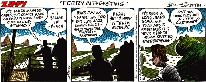
Ah, the connection to Paul Cadmus, who comes up on this blog every so often — notably in my posting on magic realism (with an example of his work), which combines realist composition allied to surrealist content, and then in a posting on George Tooker (who was influenced by Cadmus), and also in a posting on cartoonist Bill Griffith’s taste in art:

Griffy’s favorites include several “magic realists” — Hopper, Tooker, Cadmus — people who probably wouldn’t turn up near the top of other people’s lists of great artists.

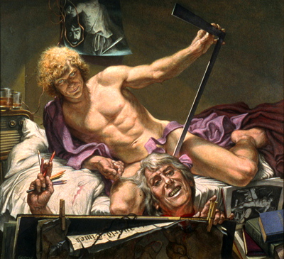
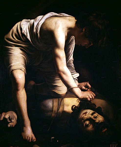
Two more paintings by Cadmus. First, Study for David and Goliath:

From the notice for a “Faces in the Crowd” show at the Colorado Springs Fine Arts Center (10/13/07 through 1/20/08):

Works included in the show include Paul Cadmus’s Study for David and Goliath, which depicts the artist and his longtime partner [Jon Andersson] reenacting Baroque artist Caravaggio’s paintings that were based on the Old Testament story.

(On the homoeroticism of Caravaggio, see this posting. One of the Caravaggio David paintings:

The Cadmus painting replaces the David figure above with something like the Cupid figure from Caravaggio’s famous Amor Vincit Omnia, in my Caravaggio posting.)

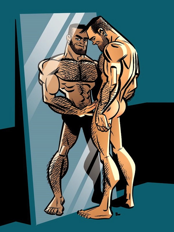
Then a male nude — a Cadmus specialty — The Bath (1951):

To complete the trio of homoerotic magic realists working in egg tempera, I bring you Cadmus’s friend Jared French:

Jared French (1905–1988) was an American painter who specialized in the medium of egg tempera. He was one of the artists attributed to the style of art known as magic realism. Other artists of this movement included George Tooker and Paul Cadmus. (link)

French’s The Double (c1950):

Challenging to interpret.


Carl Larsson

$
0
0

(About art rather than language.)

For a while now, I’ve been sending friends note cards (from Pomegranate Press) of watercolors by Swedish artist Carl Larsson. Lots of birch trees and warm bourgeois family life. Two examples: Breakfast Under the Big Birch Tree (1896) –

  (#1)

(note the dog) — and Christmas Eve (1904-05):

  (#2)

(note the cat).

From Wikipedia:

Carl Larsson (May 28, 1853 – January 22, 1919) was a Swedish painter and interior designer, representative of the Arts and Crafts Movement. His many paintings include oils, watercolors, and frescoes. He considered his finest work to be Midvinterblot (Midwinter Sacrifice), a large wall mural now displayed inside the Swedish National Museum of Fine Arts.

… After several years working as an illustrator of books, magazines, and newspapers, Larsson moved to Paris in 1877, where he spent several frustrating years as a hardworking artist without any success. Larsson was not eager to establish contact with the French progressive Impressionists; instead, along with other Swedish artists, he cut himself off from the radical movement of change.

After spending two summers in Barbizon, the refuge of the plein-air painters, he settled down with his Swedish painter colleagues in 1882 in Grez-sur-Loing, at a Scandinavian artists’ colony outside Paris. It was there that he met the artist Karin Bergöö, who soon became his wife. This was to be a turning point in Larsson’s life. In Grez, Larsson painted some of his most important works, now in watercolour and very different from the oil painting technique he had previously employed.

Carl and Karin Larsson had eight children and his family became Larsson’s favourite models.

… In 1888 the young family was given a small house, named Little Hyttnäs, in Sundborn by Karin’s father Adolf Bergöö. Carl and Karin decorated and furnished this house according to their particular artistic taste and also for the needs of the growing family.

Through Larsson’s paintings and books this house has become one of the most famous artist’s homes in the world, transmitting the artistic taste of its creators and making it a major line in Swedish interior design. The descendants of Carl and Karin Larsson now own this house and keep it open for tourists each summer from May until October.

Midvinterblot:

Not Larsson’s usual domesticity. On the painting:

Midvinterblot is a painting created for the hall of the central staircase in Nationalmuseum in Stockholm by the Swedish painter Carl Larsson in 1915. It is Sweden’s most debated painting.

The painting depicts a legend from Norse mythology in which the Swedish king Domalde was sacrificed in order to avert a famine. After a long controversy it was rejected by the museum, but the debate resurfaced again in the late 20th century, after which it was finally honoured with the place where Carl Larsson intended it to be. (link)

The major criticism was that many elements of the painting were anachronistic, historically inaccurate. And as the controversy drew on for years, the painting came to be seen as old-fashioned, insufficiently modernist.

As for the domestic drawings, they have for me the feel of the early portion of Bergman’s fabulous (in several senses) Fanny and Alexander — the lost paradise, before Fanny and Alexander’s father suddenly dies:

Fanny and Alexander (Swedish: Fanny och Alexander) is a 1982 Swedish drama film written and directed by Ingmar Bergman. It was originally conceived as a four-part TV movie and cut in that version, spanning 312 minutes. A 188-minute version was created later for cinematic release, although this version was in fact the one to be released first. The TV version has since been released as a one-part film; both versions have been shown in theaters throughout the world. The film won four Academy awards in 1984 and was nominated in six categories including Best Director (Ingmar Bergman) and Best foreign language film (won).

The story is set during 1907–09 (with an epilogue in 1910), in the Swedish town of Uppsala where Alexander (Bertil Guve), his sister Fanny (Pernilla Allwin) and their well-to-do family, the Ekdahls, live. The siblings’ parents are both involved in theater and are happily married until their father, Oscar (Allan Edwall), suddenly dies from a stroke. Shortly thereafter, their mother, Emilie (Ewa Fröling), marries Edvard Vergérus (Jan Malmsjö), the local bishop and a widower, and moves into his ascetic home where he lives with his mother, sister, aunt and maids.


noisette

$
0
0

(Mostly about art, but there’s some language in there.)

In the most recent Details magazine (April 2013), a piece on artist Urs Fischer, on the occasion of a retrospective exhibition at MOCA in Los Angeles, opening April 21. Among the three “greatest hits” listed on p. 62 is the 2009 piece Noisette:

The Details text:

This wagging tongue – which protruded from a glory-hole-like opening in a gallery wall and was activated by a motion detector – was the sleeper of Fischer’s popular solo show at New York’s New Museum.

Apparently the concept of a glory hole has made its way into the larger culture.

On the term, see my posting on it (with a link to a posting on AZBlogX); the history of the term in the sexual sense is unclear.

Now, noisette ‘hazelnut’. OED3 (Dec. 2003) has a metaphorical extension of the word:

A small round piece of meat; esp. a cut of lamb or mutton taken from the rib or loin. Usu. in pl. [cites in English from 1891 on]

That’s presumably the sense alluded to in the title of Fischer’s work. The tongue as a piece of meat.

Finally, Fischer, an artistic bad boy. From Wikipedia:

Urs Fischer (born 1973) is a Swiss contemporary artist living in New York.

Born in 1973, Urs Fischer began his career in Switzerland where he studied photography at the Schule fur Gestaltung, Zurich. He moved to Amsterdam in 1993 and had his first solo show at a gallery in Zurich, in 1996. Fischers subversive approach to art is often considered to be influenced by anti-art movements like Neo-Dada, Lost Art or the Situationist International. Since Fischer began showing his work, in the mid-nineteen-nineties, in Europe, he has produced an enormous number of objects, drawings, collages, and room-size installations.

In Untitled (Bread House) (2004-1005), Fischer constructed a Swiss style chalet entirely out of loaves of bread. His Bad Timing, Lamb Chop! (2004-2005), displays a giant wooden chair straddling a half empty packet of cigarettes. Between 2005 and 2006, he created Untitled (Lamp/Bear), an edition of three 23-foot-tall, 20-ton, fluorescent-yellow bronze bears with generic Bakelite lamps springing out of their heads; in 2011, one of the pieces was displayed for five months at Seagram Building’s plaza before being auctioned at Christie’s. For his 2007 show at Gavin Brown’s Enterprise, Fischer excavated the gallery’s main room, bringing in contractors to dig an eight-foot hole where the floor had been, and calling the result You. In Death of a Moment (2007), two entire walls are equipped with floor-to-ceiling mirrors and set in motion by a hydraulic system, to create the surreal effect of a room in flux, morphing in shape and size.

The Details piece shows the jack-hammered crater of You and one of the big bronze bears, and adds a photo of Fischer’s 2012 Burning Man: a life-sized replica of Fischer in wax, turned into a giant candle. Rachel Wolff characterizes Fischer’s work as “an in-your-face brand of Dadaist Pop Art that is designed to catch viewers off-guard”.


Correction time

$
0
0

From the NYT Magazine 4/7/13:

A March 24 article on preparing a holiday feast misidentified the state from which Cheerwine, a cherry-red soft drink, originates. It is North Carolina, not South Carolina. And an accompanying recipe for braised lamb omitted instructions for three ingredients. An onion, roughly chopped, along with a tablespoon of minced garlic and a tablespoon of minced ginger, are to be included when the dried fruit is added to the pot containing the meat in Step 1. In addition, an accompanying feature transcribed incorrectly a comment from Callie Khouri, creator of the television drama “Nashville,” about what she would put on her Easter playlist. Khouri said she would include music by Pops Staples, the late patriarch of the singing family the Staple Singers. She did not say she would include “pop staples.”

An entertaining mishearing / misinterpretation: the article is labeled as being by Callie Khouri, but clearly she spoke her comments (on the telephone or in a face-to-face interview) to someone who then turned them into text, rather than writing her comments up herself.

The article as it originally appeared:

How to Make an Easter Playlist

I would start with the Abyssinian Baptist Gospel Choir: ‘‘I Want to Ride That Glory Train’’ or ‘‘He Stays in My Room’’ or ‘‘Sweet Jesus.’’ The Johnny Paycheck version of ‘‘Amazing Grace’’ would be fun. Radney Foster’s version of an old hymn called ‘‘O Sacred Head, Now Wounded’’ is absolutely beautiful. You have to include pop staples. I would just go with the good old-fashioned ‘‘I Shall Not Be Moved.’’ There’s a song by the O’Neal Twins called ‘‘Jesus Dropped the Charges.’’ I would definitely play that.

I was reminded of a story that appeared in the Stanford Daily in 1994 about the defacement of a “seagull statue” on campus. I puzzled over this for some time, and Jacques and I tried (without success) to recall such a statue — when I realized that the reference was to a Segal statue, the Gay Liberation statue by George Segal. Presumably the story had been called in, and whoever took it down didn’t know about the Segal, so heard the name as seagull.

The statue:

On the sculptural technique, from Wikipedia:

In place of traditional casting techniques, Segal pioneered the use of plaster bandages (plaster-impregnated gauze strips designed for making orthopedic casts) as a sculptural medium. In this process, he first wrapped a model with bandages in sections, then removed the hardened forms and put them back together with more plaster to form a hollow shell. These forms were not used as molds; the shell itself became the final sculpture, including the rough texture of the bandages. Initially, Segal kept the sculptures stark white, but a few years later he began painting them, usually in bright monochrome colors. Eventually he started having the final forms cast in bronze, sometimes patinated white to resemble the original plaster.

Then a bit on the twisted history of the sculpture, from gltbq: an encyclopedia of gay, lesbian, bisexual, transgender, & queer culture:

In 1979, pop sculptor George Segal was commissioned by the Mildred Andrews Fund, a private Cleveland-based foundation that supports public art, to create a work that would commemorate New York City’s Stonewall Rebellion, the 1969 riot that conveniently (if somewhat simplistically) marks the beginning of the modern gay liberation movement.

The result was the first piece of public art commemorating the struggle of glbtq people for equality, predating Amsterdam’s “Homomonument” by some seven years.

Tellingly, Segal’s sculpture has, from the very beginning, been at the center of controversy and suffered the kinds of assaults and bashings that glbtq people themselves have all too often experienced.

… Segal’s aim in his depiction of the couples was to normalize and domesticize homosexual relationships, rescuing them from the sensationalized, over-sexualized images so common in the popular media. At the same time, however, Segal emphasizes the physical element of relationships. The partners’ soulful gazing into each other’s eyes symbolizes commitment and communion, but their touching represents physical intimacy.

… Given the reaction against the statue by the residents and governments of New York City and Los Angeles, the decision was made to seek an alternate site for the sculpture. It was decided to offer “Gay Liberation” for installation on the Stanford University campus in Palo Alto, California, a campus famous for its public sculptures.

After much wrangling, and the approval of two faculty committees and the president of the university, the Stanford Board of Regents finally voted to accept the sculpture as a long-term loan.

Less than a month after the sculpture was installed in February 1984, the work was attacked with a ball-peen hammer. The vandal(s) struck the figures about 40 times, gouging the faces and torsos, and inflicting an estimated $50,000 worth of damage. The statue was removed from display and placed in storage.

The assault sent a chill through the glbtq community at Stanford and across the nation. That such a violent attack, so reminiscent of hate crimes almost routinely visited upon glbtq people, could take place on the campus of a major university, in the shadow of San Francisco, with its large and active gay and lesbian community, underscored the vulnerability of the lesbian and gay movement.

The day after “Gay Liberation” was attacked in 1984, members of the Stanford community began placing flowers at the site. A week later 200 people gathered in White Plaza to denounce the crime. Segal issued a statement, remarking that his point in “Gay Liberation” was “a human one regarding our common humanity with homosexuals. I’m distressed that disagreement with the statement took this violent, brutal form.”

After being repaired the sculpture remained in storage for over a year, then was quietly re-installed. Less than a year later, however, it was attacked again. Someone spray-painted the word “AIDS” on the male couple.

In 1994, the sculpture was again vandalized, this time by several drunken members of Stanford’s football team, who splattered the white statue with black paint and wedged a bench between two of the four figures, resulting in approximately $8,000 worth of damage.

… The other casting of the sculpture was installed in a public park in Madison, Wisconsin and occasionally exhibited in galleries. In Madison, where it resided from 1986 until 1991, the sculpture was also vandalized on at least one occasion, though it was also beloved by many residents, who would sometimes place hats and scarves on the sculptural figures in the winter.

In 1992, however, New York City finally agreed to place Gay Liberation in Sheridan Park, just across the street from the site of Stonewall Inn.

The 1994 restoration story, from the Stanford News Service (9/16/94):

Restored Segal Gay Liberation sculpture to be reinstalled

STANFORD — Gay Liberation, the bronze sculpture group by artist George Segal, will be reinstalled on the Stanford campus Friday, Sept. 23, after a two-week period of conservation. The sculpture was damaged in an attack by seven Stanford students in the early morning hours of May 16.

The sculpture, comprised of four painted figures and two benches, was removed from its site at Stanford on Sept. 6 and taken to San Rafael for extensive restoration. Beginning at 9 a.m. on Sept. 23, the four figures will be secured to the benches and to the cement pad that serves as the sculpture’s base. It is anticipated that the reinstallation will be completed that morning.


Ralf König

$
0
0

I was pointed to a classic gay comic by the bibliography in the entertaining and informative The Dick Book: Tuning Your Favorite Body Part (Micha Schulze & Christian Scheuss, Bruno Gmünder 2013, translation of Das Schwanzbuch. Tuning für dein bestes Stück 2008): Ralf König’s The Killer Condom (2009 Ignite! Entertainment (rev. ed.); 1992 The Killer Condom Catalan Communications, translation from German by Jim Steakley of 1988 Kondom des Grauens [‘Condom of Horror’] Edition Kunst der Comics/Ralf König). Aside from the pleasures of the story, there’s some snowclonish interest.

The cover:

(All the characters have big bulbous noses. Get used to it.)

The guy with the gun is Lieut. Macaroni, of a tough, nasty city much like New York. The young man on his knees worshiping his dick is a (never-named) kid Macaroni cruises on the street and takes to the Hotel Quickie for a quick trick. (Eventually they fall in love.)

From the back cover:

It looks like a condom.
It feels like a condom.
It fits like a condom.

But it’s no ordinary condom – it’s a killer!

This is an instance of the Duck Figure, which apparently started as a quotation converted into an idiom:

If it looks like a duck and walks/quack/flies etc. like a duck, it is a duck.(humorous)
used to say that something is probably exactly what it seems to be and we should trust our judgment about it They’re calling it a clinic, not a prison, but if it looks like a duck and swims like a duck, then it is a duck, I think. (Cambridge Idioms Dictionary, 2nd ed. 2006)

and then varied in snowclone style, giving that quotation on the back cover of the book (where the expectation of duckhood is subverted) and in one passage from the book (where it’s used positively):

(The first two panels here are in the elevator going up to room 408 for their assignation.)

Wikipedia has an account of the history, which I’m not in a position to examine critically:

The duck test is a humorous term for a form of inductive reasoning. This is its usual expression:

If it looks like a duck, swims like a duck, and quacks like a duck, then it probably is a duck.

The test implies that a person can identify an unknown subject by observing that subject’s habitual characteristics. It is sometimes used to counter abstruse arguments that something is not what it appears to be.

History: Emil Mazey, the secretary-treasurer of the United Automobile Workers for 33 years, said at a labor meeting in 1946:

I can’t prove you are a Communist. But when I see a bird that quacks like a duck, walks like a duck, has feathers and webbed feet and associates with ducks—I’m certainly going to assume that he IS a duck.

Back to the killer condom. Before Macaroni heroically takes it down, it has chomped off sixteen dicks and one ball (Macaroni loses one of his testicles in an encounter with the beast). Close to the end of the story, Macaroni is on the phone to boyfriend:

And then the snarling toothy beast appears –

– only to be defeated by Macaroni.

Well, yes, this is a condom version of the vagina dentata story (and Macaroni mentions castration anxiety explicitly in the book):

Vagina dentata (Latin for toothed vagina) describes a folk tale in which a woman’s vagina is said to contain teeth, with the associated implication that sexual intercourse might result in injury or castration for the man.

Such folk stories are frequently told as cautionary tales warning of the dangers of sex with strange women and to discourage rape. (link)

Of course any man who’s fellated is confronted with actual teeth, and they could in principle (and sometimes do in actual life) bite off his cock.

It turns out that there are also folk stories in a number of cultures of the anus dentatus, so gay tops have something else to worry about when they fuck.

Not to mention worrying about being jacked off by Edward Scissorhands.

But *condoms*! Who imagined?

A note on the artist, from Wikipedia:

Ralf König (born August 8, 1960 in Soest, Germany) is one of the best known and most commercially successful German comic book creators. His books have been translated into many languages. He has resided in Soest, Dortmund and Berlin and now lives in Cologne.

He’s written a great many books, and attracts a straight audience in addition to his natural gay audience. One more panel from him, yet another take on Saint Sebastian (who comes up here regularly):

(Not only the characteristic nose (and big feet), but also the characteristic vegetation.)


Man Ray

$
0
0

(About art rather than language.)

A set of notecards from Pomegranate Press I’ve been sending to friends has images of Man Ray gelatin silver prints from the 1920s. Fascinating stuff. Two samples. First, the famous Le Violon d’Ingres (1925) –

and then Noire et blanche of 1926, with Kiki de Montparnasse (as above) with an African artifact  –

About Le Violon, from the Getty Museum website:

Man Ray was an admirer of the paintings of Jean-Auguste-Dominique Ingres and made a series of photographs, inspired by Ingres’s languorous nudes, of the model Kiki in a turban. Painting the f-holes of a stringed instrument onto the photographic print and then rephotographing the print, Man Ray altered what was originally a classical nude. He also added the title Le Violon d’Ingres, a French idiom that means “hobby.” [from Ingres's fascination with the violin]  The transformation of Kiki’s body into a musical instrument with the crude addition of a few brushstrokes makes this a humorous image, but her armless form is also disturbing to contemplate. The title seems to suggest that, while playing the violin was Ingres’s hobby, toying with Kiki was a pastime of Man Ray. The picture maintains a tension between objectification and appreciation of the female form.

And about Man Ray and this period of his life, from Wikipedia:

Man Ray (born Emmanuel Radnitzky, August 27, 1890 – November 18, 1976) was an American modernist artist who spent most of his career in Paris, France. He was a significant contributor to the Dada and Surrealist movements, although his ties to each were informal. He produced major works in a variety of media but considered himself a painter above all. He was best known in the art world for his avant-garde photography, and he was a renowned fashion and portrait photographer. Ray is also noted for his work with photograms, which he called “rayographs” in reference to himself.

… In July 1921, Man Ray went to live and work in Paris, France. He soon settled in the Montparnasse quarter favored by many artists. Shortly after arriving in Paris, he met and fell in love with Kiki de Montparnasse (Alice Prin), an artists’ model and celebrated character in Paris bohemian circles. Kiki was Man Ray’s companion for most of the 1920s. She became the subject of some of his most famous photographic images and starred in his experimental films.


Cubism

$
0
0

(About art rather than language.)

From the NYT on 4/10/13 (and on pretty much every other news outlet), a report of a spectacular gift to the Metropolitan Museum of Art in NYC: “A Billion-Dollar Gift Gives the Met a New Perspective (Cubist)” by Carol Vogel:

In one of the most significant gifts in the history of the Metropolitan Museum of Art, the philanthropist and cosmetics tycoon Leonard A. Lauder has promised the institution his collection of 78 Cubist paintings, drawings and sculptures.

The trove of signature works, which includes 33 Picassos, 17 Braques, 14 Légers and 14 works by Gris, is valued at more than $1 billion. It puts Mr. Lauder, who for years has been one of the city’s most influential art patrons, in a class with cornerstone contributors to the museum like Michael C. Rockefeller, Walter Annenberg, Henry Osborne Havemeyer and Robert Lehman.

(Money figures prominently in these reports. The art market is extraordinarily strange.)

On Cubism, from Vogel’s article:

The term Cubism first appeared in a review of a 1908 exhibition at Daniel-Henry Kahnweiler’s Paris gallery, which featured early Cubist works. What began as a collaboration between Picasso and Braque, Cubism became a pioneering movement that redefined concepts of space and time, high and low. Those artists, along with Fernand Léger and Juan Gris, took shapes that were familiar and turned them upside down, dismantling the traditional perspective.

… Some of the paintings and sculptures in Mr. Lauder’s collection were particularly radical for their time, like Picasso’s “Woman in an Armchair (Eva),” the artist’s 1913-14 image of his mistress Eva Gouel, in which he translated the female body into his own Cubist language.

Femme assise dans un fauteuil (Eva)

Two more from the Lauder collection:

Georges Braque, Le Violon (Mozart/Kubelick) (The Violin [Mozart/Kubelick]), 1912

Fernand Léger, Le fumeur (The Smoker), 1914

The Lauder gift turns the Met from a museum with hardly any Cubist paintings to one with a world-class collection.


The adventures of AZ

$
0
0

From Stan Carey, this entertaining book cover:

This appears on the Lousy Book Covers site, the motto of which is

Just because you CAN design your own book cover doesn’t mean you SHOULD.

But Stan was attracted to it because of the hero’s name.

And for another reason; Stan writes:

My favourite part of the cover (apart from the title) is the accidental duck in the top left quadrant.

(The duck’s bill is the tip of Archie’s lance.) Meanwhile, Archie appears to be drooling. That’s a (somewhat awkwardly drawn) dolphin he’s riding. The Hokusai wavelets are a nice touch.

The publisher’s blurb, from amazon.com:

[published November 15, 2010] Sixteen-year-old Archibald Zwick is vacationing with his family on a remote island in the Bermuda archipelago. Almost immediately on arrival, he takes his kayak out into the open ocean, where he soon becomes caught in a freak storm and is left disoriented and alone, not knowing where he is or how to get back.

When fatigue and fear have almost caused him to lose hope, he comes upon a mysterious city inhabited by a strange but friendly people. Archie, however, wants only to return to his parents, something that the inhabitants of this mysterious city seem unable – or unwilling – to help him do.

Instead, Archie becomes the center of a struggle that plunges the city into a deadly civil war, and he finds that his own fate is inextricably linked to that of his strange new world.

Will Archie ever find his way back to his parents and his home? And are there clues in the city’s eight towers that will point the way home?

Join young Archibald Zwick in this epic battle of good versus evil.

And the biographical note on the author:

Robert Leslie Palmer, a Birmingham, Alabama attorney, received a B.A. from Tulane University and a J.D. from Georgetown University. He thoroughly enjoys writing and for many years has published law review articles, poetry, and newspaper commentaries. After twenty-seven years in practice, he is now on sabbatical to pursue a life-long dream of writing full-time.

No, I haven’t read the book.


Zao Wou-Ki

$
0
0

(About art, and my life, rather than language.)

In the NYT national edition today (but apparently printed first on the 11th), an obit (by Paul Vitello) for painter Zao Wou-Ki, “Zao Wou-ki, Abstract Painter, Dies at 92″:

Zao Wou-ki, a Chinese émigré who merged Eastern and Western aesthetic traditions in his abstract paintings — helping to shape avant-garde art in postwar Europe and attracting a newly wealthy Asian following that made him one of the most commercially successful living artists in either hemisphere — died on April 9 in Nyon, Switzerland.

… Mr. Zao’s paintings, which are in the collections of the Museum of Modern Art, the Guggenheim and the Tate Modern, among others, have sold at auction in recent years for between $1 million and $2 million each. Since 2011, when sales of his paintings totaled $90 million, art journals and art dealers have frequently referred to him as the top-selling living Chinese artist.

Finding his own identity in that label — as a Chinese artist — was the crucible of Mr. Zao’s artistic vision.

Leaving China just ahead of the Communist takeover, Mr. Zao settled in 1948 in Paris, where his first sustained exposure to Western Modernist painting left him feeling ambivalent about the classical forms of landscape and calligraphic ink painting in which he had been trained. He loved the work of the Impressionists and Expressionists, and of contemporary artists like Jackson Pollock and Franz Kline.

But through nonobjective Western painting, especially the work of Paul Klee, who was influenced by traditional Chinese and Japanese art, Mr. Zao gained new insights into what the British art historian Michael Sullivan called “the Abstract Expressionist element in his own tradition.”

Putting aside the issue of money in the art market (now a feature of virtually all artists’ obits), there’s the remarkable blending of Chinese and European Modernist artististic traditions in Zao’s work (the Times renders his name with family name first, Chinese-style). And a story from my life.

Three more or less random selections from Zao’s paintings:

  (#1)

  (#2)

  (#3)

Now the personal story. Many years ago Ann Daingerfield Zwicky and I visited an older colleague (in philosophy) who was hoping to angle an appointment for me in linguistics at his institution — a colleague with considerable amounts of (family) money, who lived in an amazing house. At dinner, in a gigantic baronial hall with significant modern art on the walls, when our hosts were briefly out of the room, Ann pointed towards a large canvas that pretty much dominated the room, whispering that she was pretty sure it was a Zao Wou-Ki.

When our hosts returned, Ann asked politely about it, and we got an enthusiastic response from them, with a story about their having picked it up in Paris a while before. They were, rightfully, very pleased with it. Oh my.

That was in the early 1960s. It hadn’t occurred to me that Zao was still alive.


Legitimacy of comics

$
0
0

Today’s Zippy:

Griffy and Mr. (the) Toad in a meta-comic, about comics. On the growing elevation of comics to the status of an art form — as has happened many times before with other pop cultural genres (like movies and jazz).


The protean Colby Keller

$
0
0

(About “mail art” and gay porn and playfulness.)

From Will Parsons on Google+ a little while back, a link to Colby Keller’s blog, with the comment:

+Arnold Zwicky, your art has a name!

The blog entry is about “mail art”; Will’s allusion is to my collages and my captioning of images from gay porn and male photography (which I then mail to friends, and sometimes post on one or another of my blogs).

Keller’s self-description on his Twitter account:

Artist, Blogger, Porn Star, Video Sexpert for Manhunt.Net’s Get In Bed with Colby Keller, I SEE PENIS aficionado. Baltimore.

I SEE PENIS refers to Keller’s enthusiasm for finding phallic images all over the place — an interest he and I share (see my many postings on “phallicity”).

On Keller’s work in gay porn and his sex advice for gay men, see the posting “Sex with Colby Keller” on AZBlogX.

Before I go on to “mail art”, some words on Keller’s physical appearance, which varies enormously. At one end of the scale, there’s the bushy-bearded, furry-bodied, long-haired redhead of my “Sexy St. Patrick’s” posting, seen here with his big dick suppressed:

  (#1)

[Important correction from Michael Palmer: "The redhead with the full beard in the St. Patrick’s Day ad at the top of your post isn’t Colby Keller, but James Jamesson, most commonly (perhaps exclusively) of the nextdoor studios franchise" (his blog here). Like Keller, Jamesson alters his appearance every so often, but he seems to stick to red hair.]

At the other end of the scale, there’s the geeky guy in the photo on Keller’s blog, with relatively short, dark brown hair, merely scruffy face, and lightly furred body (again with dick suppressed for WordPress):

  (#2)

(In real life, Keller sometimes does wear glasses — but not, I think, in his porn work.)

In between, there’s the intense Keller displaying his body (seen here from navel on up) on a publicity shot (full photo in “Easter Threesomes”):

  (#3)

And the amiable, short-haired, clean-shaven, barely furry Keller of this publicity photo:

  (#4)

One step on the route from hairy Keller to smooth Keller can be seen here in this photo (sent to me by Chris Ambidge):

  (#5)

(Ouch! Distinctly visible razor burn.)

Now to Keller’s entry “Fluxus fucks us” on his blog:

Bitch please. Fluxus NEVER dies!

At least according to Hungarian mail (male) art aficionado Peter Kupás, who sent me the follow Fluxus-esque fliers, filled with talking assholes and covered in stickers. If you’re unfamiliar, Fluxus was a neo-Dada “anti-art” movement of the 1960s founded by Lithuanian-born George Maciunas and based partially on the experimental compositions of queer composer John Cage. Artists such as Joseph Beuys, Nam June Paik and Yoko Ono took part in Fluxus events and are associated with the movement.

“Mail art” first found headway in the Fluxus movement with artist Ray Johnson. The term New York Correspondance School, associated with Johnson’s work, came to characterize mail art (and yes, correspondance is intentionally misspelled). One piece, published in a 1971 edition of Arts Magazine, asked readers to alter an image of the proto-punk poet Arthur Rimbaud. Check out the “New” New York Correspondence School to see current examples.

Or simply consult the brilliant Peter Kupás himself HERE.

Three samples from Kupás can be viewed in “Mail art” on AZBlogX (the dicks and assholes make them unsuitable for WordPress).

On Fluxus:

Fluxus — a name taken from a Latin word meaning “flow, flux” (noun); “flowing, fluid” (adj.) — is an international network of artists, composers and designers noted for blending different artistic media and disciplines in the 1960s. They have been active in Neo-Dada noise music and visual art as well as literature, urban planning, architecture, and design. Fluxus is sometimes described as intermedia. (link)

And on mail art:

Mail art (also known as Postal art and Correspondence art) is a populist artistic movement centered around sending small scale works through the postal service. It initially developed out of the Fluxus movement in the 1950s and 60s, though it has since developed into a global movement that continues to the present. The American artist Ray Johnson is considered to be the first mail artist, and the New York Correspondence School that he developed is considered the first self-conscious network of mail artists.

Media commonly used in mail art include postcards, paper, a collage of found or recycled images and objects, rubber stamps, artist-created stamps (called artistamps), and paint, but can also include music, sound art, poetry, or anything that can be put in an envelope and sent via post. Mail art is considered art once it is dispatched. Mail artists regularly call for thematic or topical mail art for use in (often unjuried) exhibition.

The mail artist community values the interconnectedness of the participants and promotes an egalitarian ethos than frequently circumvents official art distribution and approval systems such as the art market, museums, and galleries. Mail artists rely on their network as the primary way of sharing their work, rather than being dependent on the ability to locate and secure exhibition space. The community embraces this outsider or alternative status, and refers to itself as “The Eternal Network” or just “The Network.” At its core, mail art is about interpersonal communication, exchange and the creation of a virtual community of participants. In this way, mail art can be seen as anticipating the cyber communities founded on the Internet. (link)

(My collaging and captioning are not, strictly speaking, mail art, because I’m not part of this network and mail things to only a few friends. I’ve also never incorporated cancellation marks into my works, though many mail artists do. See the samples available on the net, in Images for “mail art”. But what I do is close in spirit to mail art.)

From other postings on Keller’s blogs, a Cinco de Mayo number for this year, with this playful photo, entitled “Gay love for geeks”:

  (#6)

Don’t recognize the art in the background, but the book Keller is displaying (with the hedgehog and the fox on the cover) is Curiosity and Method: Ten Years of Cabinet Magazine (ed. by Sina Najafi) — a book that (as a fellow admirer of Cabinet magazine) I happen to own.

And a posting with a penis-hugging Paper Colby — Keller calls it kokigami (for cock origami) — for you to make:

  (#7)

The kokigami was drawn by Canadian comic book artist and writer J. Bone (Wikipedia page here, his website here); Bone shares with Colby Keller an appreciation for scruffy men and men with big pecs, tastes that show up in his drawings, like this male pin-up:

  (#8)


Pin-up boys

$
0
0

(On gender and sexuality.)

From Franzo Law via Facebook, a pointer to this wonderful Men-Ups! site by Rion Sabean, offering

A restructuring of the ways in which males are presented in popular media, applying traditional pinup poses that are reserved for the female form, while still presenting the models in ‘masculine’ clothing [and engaged in stereotypically masculine activities].

One example:

  (#1)

A skateboarder, his chest pushed out in front (as if displaying breasts), his butt pushed out in back (another sexual display), lips slightly pursued in a moué, and a saucy expression on his face.

More text from Sabean:

Society defines the sexes as being inherently born with exclusive traits that are actually imposed by the society itself. From things as small as colour, attire, and even posing, the sexes are forced into accepting ideals that are unborn [that is, unborn 'not inborn'].

Men-Ups! is a project aimed at reversing the stereotypes created by society, begging [that is, asking] the questions; why is it sexual for a female to pose one way, and not sexual for a male? Why is it considered more comical or unsettling for males to act the more socially defined feminine?

(Sabean describes himself as “a 27 year old graduate of the University of South Florida with a BFA in Studio Art/Photography.”) Three more examples, from the 12 on his site (all the models are gazing directly, provocatively, at the viewer):

  (#2)

A lumberjack doing a gam display, legs together modestly but coquettishly, mouth pursed.

  (#3)

A soldier in camo, legs in the air, with slightly pursed mouth.

  (#4)

A hunky ditch-digger doing an even more extreme legs-in-the-air display. My favorite in the set.

This is not the first arch send-up of classic pin-up photos and drawings using men. There’s also Paul Richmond’s Cheekcake Boys, introduced in this video:

From a HuffPo piece on Richmond’s work:

Paul Richmond’s ‘Cheesecake Boys’ Features Men In Classic Pin-Up Poses

Each of Richmond’s “Cheesecake” pieces references iconic imagery with a modern twist. “Beach Bum,” which stars writer and artist Alan Ilagan, is a masculine take on the “Coppertone Baby,” while “Blast from the Past” [starring Darryl Stephens] is a gender-bending re-creation of Marilyn Monroe’s sexy subway grate scene from “The Seven Year Itch.”

“Each figure is shown in the midst of a revealing and ‘accidental’ wardrobe malfunction, struggling to gather his aplomb and his pants without ever losing his cool,” Richmond told The Huffington Post in an email. “It intrigues me that it was almost exclusively women who were depicted as hapless victims of skin-baring circumstance, such as the pin-up girls by Gil Elvgrin and Art Frahm. Those ladies couldn’t even walk down the street without their skirts blowing up or their underwear falling down — or both!”

View all of Richmond’s “Cheesecake Boys” series here.

Note that Richmond emphasizes the skin-baring tradition of classic cheesecake, while not disregarding the postures and facial expressions of the genre. The cover of his book:

  (#5)

Then “Blast from the Past”:

  (#6)

And my favorite, “Beach Bum”, with its title punning on bum:

  (#7)

A cute gayboy (in stunning rainbow trunks) pulls another man’s trunks down with his teeth; his prey is astonished.

Sabean leans towards social criticism, Richmond towards humor for queers.

On to an artist who emphasizes the hotness of the men he draws rather than the humor in his depictions (though the humor is there): J. Bone, whose pin-up drawing of his character Josh appeared at the end of my posting on Colby Keller. Another image of (scruffy, big-pec’ed) Josh, this time confronting his twin in a mirror:

  (#8)

Bone does superhero comics, but he’s not above exploiting his male characters for their their simultaneous humorous and homoerotic potential, as in this drawing of the Justice League of America men’s locker room:

  (#9)

and this one of Peter Parker (aka Spider-Man) at home:

  (#10)

On to pin-up boys in manga style from artist Celesse, here a cowboy:

  (#11)

Then to pin-up boys that are frankly intended to be erotic (usually homoerotic) and emphasize masculinity, even hyper-masculinity. There’s even a magazine; here are the covers of issues #3, 2, and 1 (from left to right):

  (#12)

That leads us to the world of male pin-up calendars, which again are intensely masculine in focus (and dead serious). One vein of this stuff is X-rated; much of it comes from gay porn studios, and the men in it are photographed in conventional porn postures, strongly focused on dicks (and sometimes butts). Examples on AZBlogX, in 9/8/11 “Calendar Time” and 10/21/11 “Calendars and compendia”.

Another genre of male pin-up calendars avoids full-frontal nudity, but just barely: the focus is on the dick you don’t actually see. I’ve called these cock tease shots. Some discussion in this blog on the 2012 Boy Next Door calendar by David Arnot , here, and on his 2013 calendar and Philip Fusco’s calendar, here.

The male pin-up calendars range from crude porn shots to artful male photography. And they cater to a spectrum of sexual interests. From a posting of mine in January, with a discussion of

the “types” of men who get to be subjects of male calendars and of male porn in general: a catalog of sexual interests. Twinks of course, but also: uncut men, men in business garb, ranch hands (the cowboy fantasy), college men, Latinos, hustlers (from rentboy.com), Cubans, black men, bears, fitness models, rugged guys, leather men, international models. (Then, in porn flicks, any number of fetishes, plus specialties like heavily tattooed men, and, at the other extreme, inkless men. And in calendars, the totally dick-focused presentation of models from underneath, as they would be viewed by a man on his knees in front of them; it makes the cocks look really, really big.) The David Arnot models I posted about count as hunks or studs, all-purpose categories for hot men outside of the twink/bear/leather axes.

In any case, there’s an extraordinary range of male pin-up art (drawings and photography) out there.


xx


More cattions: Reh, Bjorn, Sekigushi

$
0
0

On AZBlogX: a piece on male photographer Michael Reh (not actually X-rated) and another set of cattions (male art + a cat + a caption), this time based on the male photography of Reh and of Kristen Bjorn (totally X-rated) and on the homoerotic (but not actually X-rated) drawings of Kino Sekigushi.

As in the two earlier collections, the cattions are variously poetic, funny, slyly queer, and vulgar, often several at once.


Paul Sietsema

$
0
0

(About art rather than language.)

In the mail recently, a flyer for an exhibition at the Wexner Center for the Arts at Ohio State, featuring work by Paul Sietsema. In particular, this fascinating reflection on painting (in several senses):

  (#1)

Sietsema was new to me, but he bears looking into.

From Wikipedia:

Paul Sietsema (born 1968) is an artist based in Los Angeles and Berlin. He completed his undergraduate studies at University of California at Berkeley in 1992 and received an MFA from UCLA in 1999. Sietsema uses “photographs and other objects that reference specific bodies of knowledge as starting points for his carefully crafted drawings and sculptures, which he then films.”

(Artists describing what they’re doing in their work can be specific but impenetrable or vague or jargon-ridden or some mixture of these. Not that I know how to write this stuff; faced with the task of describing my own work, I’m inclined to trivialize it, but in plain language.)

#1 above is in a series of reflections on painting. Here’s a very different work, his “Taxi Drawing”:

  (#2)

This has a human figure in it, anchoring the lower left corner, but otherwise it’s a fascinating amalgam of the inorganic and the organic, wth superposed points of view.


Philip Taaffe

$
0
0

(About art rather than language.)

Andrea K. Scott, “Critic’s Notebook: Imaging Systems”, in the May 20th New Yorker:

Remember beauty? For a refresher course, visit Philip Taaffe’s new show – a dozen kaleidoscopic big paintings and a wall of sixteen black prints – his first at the Luhring Augustine gallery, to which he decamped from the international supermarket chain that is Gagosian. Taaffe, fifty-eight, has spent years honing his unique approach, applying sourced imagery to canvas with stencils, rollers, and stamps. The results are pictorial conflations of organism and ornament that suggest the botanical studies of Karl Blossfeldt tiled at the Alhambra or Ernst Haeckel’s “Art Forms in Nature” inlaid at the Taj Mahal. Not every new canvas here thrills, but taking in the wheeling symmetries of “Illuminated Constellation” feels like chanting ecstatically with your eyeballs. Taaffe’s paintings are analogue all the way, but his fascination with layers, his nonhierarchical spirit – he’s as influenced ny the biomorphic patterns of sea kelp as he is by Mark Rothko’s Surrealism – and his restless circulation of images should make him a hero to the digitally minded young artists of the twenty-first century.

“Illuminated Constellation”:

  (#1)

(Taaffe’s own website here, a minimal Wikipedia entry here.)

Three more works, with diverse compositional techniques:

  (#2)

  (#3)

  (#4)

Many of these paintings convey a sense of some design trying to emerge from behind, or underneath, the surface pattern.


Albert York

$
0
0

(About art rather than language.)

From the 6/3 New Yorker, p. 10, under Galleries–Uptown:

Albert York

The painter, who died in 2004 [actually 2009], at the age of eighty, may be the most esteemed artist you’ve never heard of. (The sculptor Robert Grosvenor owns a couple of York’s diminutive pictures and has been known to travel with them.) Each still-life and landscape exudes an exquisite weirdness. A skeleton relaxes on a lawn with a nude woman; an alligator creeps into a field. The paintings here were made in the sixties and seventies, but you might think they were a hundred years older. As York once told Calvin Tompkins, who profiled him for this magazine in 1995, “The modern world just passes me by. I don’t notice it. I missed the train.” Through June 14. (Davis & Langdale, 231 E. 60th St. …)

There’s a minimal Wikipedia article:

Albert York (1928–2009) was an American painter.

York painted the beauty he saw in the world, once telling an interviewer, “I think we live in a Paradise. . . . This is a Garden of Eden.”

Michael Brenson of the New York Times described him as a “reclusive painter of deliberate, dreamlike landscapes, still lifes and portraits.”

Three samples of York’s fascinating work:

  (#1)

A photo of York, with a still life.

  (#2)

Tulips shooting up straight out of the ground, horse and rider in the background.

  (#3)

The skeleton and nude mentioned in the New Yorker.


Claude Smith

$
0
0

In my e-mail this morning:

Sebastopol, CA, May 31, 2013: RiskPress Gallery, in the West Sonoma County town of Sebastopol, hosts the work of artist Claude Smith in Words Fall Away – a solo exhibition that addresses the subject of written and spoken language, July 5-28, 2013.

  (#1)

The artist’s statement:

Words Fall Away is an overview that spans 15 years of work (1998-2013) related to language, words written and spoken, unspoken and never written. The work emerged from open-ended experiments in non-verbal communication, not talking for days and days at a time, which were not done within the context of specially arranged silent meditation retreats or workshops but simply as a different way to move through my everyday life and activities. The experiments were also a visceral response to observing the pervasive use of language to manipulate and obfuscate regardless of form or context. To a greater extent though, I was very interested in a first-hand experience of what might happen internally and externally if I chose to stop speaking for moments, minutes, hours, days, weeks at a time.

Writing, drawing, scribbling and scrawling have always been an integral part of my life. This show is dedicated to my father, Sidney Smith, painter and calligrapher, who introduced me to beautiful writing and art-making in New York City in the early 1950′s. I would also like to thank master graphologists, Janice Klein and Roger Rubin, for their mentorship and friendship in the study of graphology [the study of handwriting] and more. And, finally, I’d like to thank all the musicians in my life who take me to places that only music can reveal.

(A longer bio is on his webpage.)

As you might have expected, this artist is not the only one with the name Claude Smith. There’s also an American cartoonist Claude Smith (1913-2003), who drew for the New Yorker (often with a golf theme) and Playboy (on, unsurprisingly, sexual themes), as in these two samples:

  (#2)

  (#3)

Language doesn’t seem to have been much of a concern for this Claude Smith.


Once again, same-sex relationships in the New Yorker

$
0
0

The cover of the forthcoming New Yorker:

(#1)

Bert and Ernie view SCOTUS, in the light of this week’s DOMA and Prop 8 rulings.

From the New Yorker website:

“It’s amazing to witness how attitudes on gay rights have evolved in my lifetime,” said Jack Hunter, the artist behind next week’s cover, “Moment of Joy.” Hunter, who originally submitted his image, unsolicited, to a Tumblr, continued, “This is great for our kids, a moment we can all celebrate.”

The cover has elicited considerable hostility — some from those who condemn homosexuality, some specifically from opponents of same-sex marriage, but also some from people who take the cover to be an insult to Sesame Street and Jim Henson.

Meanwhile, the magazine has assembled a slideshow of nine covers with a same-sex theme. (The title of the site is “Gay Marriage on the New Yorker’s cover”, but not all the covers are about same-sex marriage.) Here’s the whole set:

1. 6/13/94 by Jacques de Loustal, with twogrooms at their wedding in front of their wedding cake with two miniature grooms on top of it:

(#2)

2. 6/17/96 by Barry Blitt, with a couple reenacting a famous World War II kiss:

(#3)

3. 1/27/03 by Harry Bliss, with football players huddling up together and a bit of grab-ass:

(#4)

4. 3/15/04 by Mark Ulriksen, with a man abnd a woman both trying on wedding gowns:

(#5)

5. 7/25/11 by Barry Blitt, with two brides, walking hand-in-hand, crossing the Brooklyn Bridge to get married in Manhattan:

(#6)

6. 5/21/12 by Bob Staake, a rainbow White House, posted in “More gay flag”.

7. 6/25/12 by Gayle Kabaker, a bridal couple, posted in “June brides”.

8. 5/13/13 by Chris Ware, on Mothers Day:

(#7)

9. 7/8/13, the Jack Hunter cover in #1 above.

Of the artists for the covers in #1 through #7, only Harry Bliss has appeared in this blog before, in “Famous models” of 12/11/12 (and on Language Log, here). But I posted on Language Log back in 2008 on a Barry Blitt cover (with Michelle and Barack Obama) that was the center of some controversy. Blitt has two covers in tlhe set above, so here are some words about him. From Wikipedia:

Barry Blitt (born April 30, 1958 in Côte Saint-Luc, Quebec) is a Canadian-born American artist.

Barry Blitt is a cartoonist and illustrator, best known for his New Yorker covers and as a regular contributor to the op-ed page of the New York Times. Blitt creates his works in traditional pen and ink, as well as watercolors.

He also illustrates children’s books.

On Blitt and Obama:

In spite of the controversy and condemnation by the Obama campaign, after taking office President Barack Obama chose one of Blitt’s New Yorker covers to hang in the White House. The Dec. 8, 2008 cover depicts the President picking the family dog at the same time as he is vetting candidates for his national security cabinet. Additionally, President Obama requested and received a signed New Yorker cover by the artist, which depicts the President walking on water.

(#8)

(#9)

From Vanity Fair, an illustration accompanying “Men Evolving Badly” (from Honest Abe to The Donald) by James Wolcott:

(#10)


More Magritte

$
0
0

(About art rather than language.)

Today’s Zippy:

(#1)

Zippy comes back to Magritte every so often. Surrealists stick together.

Last time around: “Magritte” 7/19/12.

Three more paintings alluded to in the cartoon:

Not to be Reproduced:

(#2)

The Lovers:

(#3)

Golconda:

(#4)

(It’s raining men.)


Viewing all 102 articles
Browse latest View live