Quantcast
Channel: Art/lit/music/film – Arnold Zwicky's Blog
Viewing all 102 articles
Browse latest View live

Recruiting men

$
0
0

A feature from Advocate.com last December: “The Golden Age of Denial: Pimping the Military” by Christopher Harrity, on recruitment art of the last century. Two themes (of several) in the feature: bare-chested men thrusting phallic symbols; and orgies of gang bathing.

(Hat tip to George V. Reilly on Facebook.)

On theme 1, a J.C. Leyendecker Collier’s cover (one of two such images in my 2011 posting on Leyendecker):

(#1)

And then Gun Crew Loading a 5″ 38 Caliber Gun and 4″ 50 Caliber Mark XII Gun Crew in Action, Navy recruitment posters by McClelland Barclay:

(#2)

(#3)

On Barclay:

McClelland Barclay (1891–1942) was an American painter of pinup art. Born in St. Louis in 1891, Barclay studied first at the Art Institute of Chicago, then later at the Art Students League in New York City, under George Bridgman and Thomas Fogarty. By the time he was 21, Barclay’s work had been published in The Saturday Evening Post, Ladies’ Home Journal, and Cosmopolitan.

… During the 1920s and 1930s, McClelland Barclay’s images were selected for use by art directors for the nation’s most popular periodicals including Collier’s, Country Gentleman, Redbook, Pictorial Review, Coronet, Country Life, The Saturday Evening Post, The Ladies’ Home Journal, Cosmopolitan, and a host of movie magazines. He began painting movie poster art for Hollywood studios during the 1930s as well and was considered a superstar in the film industry. (Wikipedia link)

On theme 2, we start with a series of patriotic (and homoerotic) ads for Cannon towels:

(#4)

(#5)

(#6)

Plus gang bathing with Ivory Soap:

(#7)

Oh my.


Marc Simont (and James Thurber)

$
0
0

In the NYT on the 17th, an obituary “Marc Simont, Classic Children’s Book Illustrator, Dies at 97″ by Margalit Fox, beginning:

Marc Simont, an acclaimed illustrator whose work, embodying both airy lightness and crackling energy, graced some of the foremost titles in children’s literature, died on Saturday [July 13th] at his home in Cornwall, Conn.

On his art work:

Mr. Simont (pronounced sih-MONT) received the Caldecott Medal, considered the Pulitzer Prize of children’s book illustration, in 1957 for “A Tree Is Nice,” written by Janice May Udry and published in 1956.

His art for that book, a prose poem about the beauty of trees, is a distillation of his characteristic style: painterly, with rich, jewel-like colors; spare, without a wasted line, yet detailed enough to capture an entire world in microcosm; and imbued with a lacy delicacy that recalls the paintings of Raoul Dufy.

Over more than half a century, Mr. Simont illustrated nearly 100 books, his work paired with texts by some of the world’s best-known writers for young people, including Margaret Wise Brown, Karla Kuskin, Faith McNulty and Charlotte Zolotow.

With Ms. Kuskin, he collaborated on two picture books now considered classics: “The Philharmonic Gets Dressed” (1982), which depicts the minute preconcert preparations of the members of a symphony orchestra, and “The Dallas Titans Get Ready for Bed” (1986), which does likewise, postgame, for the members of a football team.

(#1)

From Wikipedia:

Marc Simont (November 23, 1915 – July 13, 2013) was a Paris-born American artist, political cartoonist, and illustrator of more than a hundred children’s books. Inspired by his father, Spanish painter Joseph Simont, he began drawing at an early age. Simont settled in New York City in 1935 after encouragement from his father, attended the New York National School of Design, and served three years in the military.

Simont’s first illustrated children’s book was published in 1939.

Along the way he illustrated several books by his friend James Thurber, notably Thurber’s The 13 Clocks:

The 13 Clocks is a fantasy tale written by James Thurber in 1950, while he was completing one of his other novels. It is written in a unique cadenced style, in which a mysterious prince must complete a seemingly impossible task to free a maiden from the clutches of an evil duke. It invokes many fairy tale motifs.

The story is noted for Thurber’s constant, complex wordplay, and his use of an almost continuous internal meter, with occasional hidden rhymes — akin to blank verse, but with no line breaks to advertise the structure.

… By the time he wrote this book, Thurber was blind, so he could not draw cartoons for the book, as he had done with The White Deer five years earlier. He enlisted his friend Marc Simont to illustrate the original edition. (Wikipedia link)

The cover of the original edition:

(#2)

This is one of my favorite books of all time. The beginning of the story:

The evil Duke of Coffin Castle lives with his good and beautiful niece, the princess Saralinda. A few days before Saralinda’s twenty-first birthday, Prince Zorn of Zorna arrives in the town disguised as a minstrel named Xingu. After meeting an enigmatic character known as the Golux, who declares his intention to help Zorn rescue the Princess, Zorn gets himself arrested and imprisoned.

The Duke gives suitors for Saralinda impossible tasks to perform, and when they fail, kills them and feeds them to a disgusting creature called the Todal (which looks like a blob of glup, makes a sound of rabbits screaming, and smells of old, unopened rooms — and gleeps while devouring a victim). Quotations from the Duke:

We all have flaws, and mine is being wicked.
I’ll slit him from his guggle to his zatch.

And from the Golux:

I make things up, you know.
I make mistakes, but I am on the side of Good.
Never trust a spy you cannot see.

Zorn confronting the Duke:

(#3)

After The 13 Clocks came The Wonderful O, also illustrated by Simont:

The Wonderful O is the last of James Thurber’s five short-book fairy tales for children. Published in 1957 by Hamish Hamilton / Simon Schuster, it followed Many Moons (1943), The Great Quillow (1944), The White Deer (1945) and The 13 Clocks (1950).

As well as constant, complex wordplay, Thurber uses other literary devices such as frequent internal meter or rhythmic prose, near-poetry, puns, literary allusions (e.g to wandering minstrels) and thus creates a humorous satire involving loss, love and freedom. The Wonderful O uses a form of constrained writing or lipogram where the letter O is omitted at the demands of the villains.


The city in scrapwood

$
0
0

(About art rather than language.)

Caught recently in the New Yorker, this re-envisioned city:

(#1)

The fine print, going up the right side:

Condé Nast 2013. Sculpture by James McNabb. Created exclusively for the New Yorker Festival. Photographed by Grant Cornett.

Amazing stuff.

One of many appreciations, from Pinar on My Modern Met on 1/22/13:

Incredible Wood-Carved Cityscapes by James McNabb

The City Series is a collection of wooden sculptures by designer James McNabb that mimics the skyscrapers that make up the New York City skyline. The Philadelphia-based artist uses a band saw to skillfully “sketch” his model metropolises, carving into separate scraps of wood and assembling them together to represent an eclectic mix of buildings.

Initially, the intent behind the artist’s work was far more abstract. After he had created 250 pieces of uniquely carved geometric woodblocks within a 24-hour period, McNabb recognized a similarity between their united assortment and an urban skyline. Since this discovery, the designer has been continually creating a variety of “buildings” to align in new and innovative formations.

McNabb takes the silhouette of modern cityscapes to another level of attraction with his eye-catching compositions. Rather than simply constructing his tiny towers on a flat, gridded plane, the artist has found new and inventive ways to present his miniature cities, including a display within a giant wheel. McNabb is also known to create no two individual pieces that are alike, calling this creative choice “a reference to the idea that cities are the land of endless possibility.”

The city afloat:

(#2)

and the city in an endless cycle:

(#3)

From McNabb himself:

The City Series is a collection of wood sculptures that represent a woodworker’s journey from the suburbs to the city. Each piece depicts the outsider’s perspective of the urban landscape. Made entirely of scrap wood, this work is my interpretation of making something out of nothing. Each piece is cut intuitively on a band saw, resulting in a collection of architectural forms, each distinctly different from the next.

I really want to see them in three dimensions. And smell them.


Jacob and the angel

$
0
0

From Chris Ambidge, this image — by Léon Bonnat (1876) — of Jacob wrestling the angel:

(#1)

If you don’t know the story, the work looks decidedly homoerotic. Glutes in fur.

The background, from Wikipedia:

The account of Jacob wrestling with the angel is a story found in the Book of Genesis, and referenced elsewhere such as Genesis 35:1-7 and Hosea chapter 12. The account includes the renaming of Jacob as “Israel”, literally “He who struggles with God.”

The being with which Jacob wrestles is variously described as an angel, a man, or God. Some would see here different source texts, while other readings attribute the different descriptions to the fluid language of myth. In any case, the being says his name is the same as where the fight takes place, which Jacob names Peniel or Penuel or Phanuel. [Genesis 32:29-30] The event occurs during Jacob’s journey back to Canaan.

The Masoretic text reads as follows:

The same night he arose and took his two wives, his two female servants, and his eleven children, and crossed the ford of the Jabbok. He took them and sent them across the stream, and everything else that he had. And Jacob was left alone. And a man wrestled with him until the breaking of the day. When the man saw that he did not prevail against Jacob, he touched his hip socket, and Jacob’s hip was put out of joint as he wrestled with him. Then he said, “Let me go, for the day has broken.” But Jacob said, “I will not let you go unless you bless me.” And he said to him, “What is your name?” And he said, “Jacob.” Then he said, “Your name shall no longer be called Jacob, but Israel, for you have striven with God and with men, and have prevailed.” Then Jacob asked him, “Please tell me your name.” But he said, “Why is it that you ask my name?” And there he blessed him. So Jacob called the name of the place Peniel, saying, “For I have seen God face to face, and yet my life has been delivered.” The sun rose upon him as he passed Penuel, limping because of his hip. Therefore to this day the people of Israel do not eat the sinew of the thigh that is on the hip socket, because he touched the socket of Jacob’s hip on the sinew of the thigh. —Genesis 32:22-32

The scene has been drawn or painted or sculpted hundreds of times. Sometimes the angel is masculine, sometimes (as in Rembrandt’s version, below) feminine:

(#2)


Naughty Little People

$
0
0

(Humorous, often sexual, art.)

A set of postcards from Laurence King Publishing. From the publisher’s site:

Containing 21 detachable postcards of miniature scenes in which naughty little people engage in surprising, funny, titillating or simply obscene behaviour, this book gives readers a humorous look beneath the veneer of polite society.

 Artists Vincent Bousserez, Jonah Samson, Lisa Swerling and the Rainbowmonkey make stunning use of miniature scenes to create startling situations and amusing, memorable images. The pictures play with the notions of surprise and hidden drama, inviting the viewer to take a peek into the darkly funny depths of human behaviour – from the silly and the crude to the disturbing and the mysterious.

“Forbidden Fruit”:

(#1)

Another sexual one:

(#2)

One in a series in which the little people disport themselves on the human body:

(#3)

And one with the little people in other contexts, as in this skating on lines of cocaine:

(#4)


London Zoo animals

$
0
0

Another book of artistic postcards, this time with posters for London Transport to the zoo in the ’20s and ’30s, featuring gorgeous stylized animals, as depicted by artists and designers of the time. Very hard indeed to pick just a few, but here I’ll reproduce three.

Background about the posters, from the Pomegranate Press site:

London Zoo: Art for London Transport Book of Postcards

The world’s first subterranean railway, the London Underground opened in 1863 and now provides three million rides daily. In 1908, Underground executive Frank Pick began seeking out the country’s best artists and designers to produce advertising posters for the expanding transit system. Pick recognized the potential of this new graphic medium, born just a decade earlier but already transforming the urban space, and the Underground became an important patron of the arts and an acknowledged leader in the field of poster publicity.

For a century, copies of every poster produced for the Underground and its affiliates were kept, and when the collection was transferred to London Transport Museum in the 1980s, it contained more than five thousand printed posters and almost one thousand original artworks. Steadily growing since then, the collection offers a uniquely comprehensive overview of a century of British graphic design. This book of postcards reproduces thirty Underground posters advertising travel to London Zoo—one of the city’s favorite public-transport destinations.

First, a wonderful playful caricature of a chameleon — a chameleon of the mind — by Oleg Zinger from 1935:

(#1)

About Zinger, from French Wikipedia (there’s an entry in German Wikipedia too, but not, apparently, in English Wikipedia):

Oleg Zinger est un peintre contemporain franco-russe né à Moscou le 3 février 1910 et mort à Nîmes le 9 janvier 1998. Son père, Alexandre Zinger, est un savant, ayant notamment rédigé quelques ouvrages sur la physique et la botanique, et sa mère, Vera Pawlova, est une actrice du théâtre d’art de Moscou.

Notamment peintre animalier, on retrouve principalement dans les œuvres d’Oleg ses goûts, pris très jeune, pour la nature et les animaux mais également son goût pour le jazz, qu’il découvrira plus tard par ses voyages en France et aux États-Unis.

Another Zinger, a spectral lemur from 1933:

(#2)

Then from another hand, Charles Paine in 1921, some penguins:

(#3)

From the London Transport Museum Shop:

Charles Paine was a versatile and prolific designer. His training started with an apprenticeship in stained glass. He also attended evening classes at Manchester School of Art, before moving to London to further his study. His time at the Royal College of Art however was interrupted by military service. During the 1920s he designed posters for the Underground Group and in the 1930s he lived and worked in Welwyn Garden City, before moving to Jersey.


Manga matters

$
0
0

(Mostly about art.)

Two things: a note on the rich set of books offering instruction in drawing manga; and some material on Haida Manga.

Instruction books. My grand-daughter appeared at breakfast on Saturday with two books on drawing manga (plus drawing paper and pencils). If I remember correctly, these were:

Mastering Manga with Mark Crilley: 30 drawing lessons from the creator of Akiko, by Mark Crilley (2012)

(#1)

Manga for the Beginner: Everything you Need to Start Drawing Right Away!,  by Christopher Hart (2008)

(#2)

Two more, from a very rich set of books:

(#3)

(#4)

Haida Manga. A syncretic art form. From Wikipedia:

Haida Manga is a contemporary style of Haida comics and print cartoons that explores the elements of both traditional North Pacific indigenous arts and narrative, while also adapting contemporary techniques of artistic design from the Eastern portion of the North Pacific, namely the Japanese manga from which its name derives. Haida manga have so far been published in several countries including Japan, South Korea, China, Taiwan, Macao, France, and Canada.

Haida Manga has been recently popularized by artist Michael Nicoll Yahgulanaas who is considered as the father of Haida Manga, making its first debut in 2001 in his book, A Tale of Two Shaman which led to a series of exhibits (such as at Expo 2005 and Tokyo Designers Week 2003) and multiple print runs in Japan and Korea. Asian interest in the graphic appeal of Haida design is enhanced by the narratives which advocate a hopeful and empowering message. Michael Nicoll Yahgulanaas expresses his own interest in Haida Manga in that it is “not part of the settler tradition of North America (like Archie or Marvel comics, for example)”.

On the Haida:

The Haida … are an indigenous nation of the Pacific Northwest Coast of North America. Their main territory is the archipelago of Haida Gwaii [formerly the Queen Charlotte Islands] in northern British Columbia, but many live across Dixon Entrance in Southeast Alaska.

… The Haida language has sometimes been classified as one of the Na-Dene group, but is usually considered to be an isolate.

Haida society continues to be very engaged in the production of a robust and highly stylized art form, a leading component of Northwest Coast art. While frequently expressed in large wooden carvings (totem poles), Chilkat weaving, or ornate jewelry, it is also moving quickly into works of popular expression such as Haida manga.

Two traditional Haida designs: a salmon and an otter with a sea urchin:

(#5)

(#6)

And on the Haida Manga artist:

Michael Nicoll Yahgulanaas (born 1954) is a visual artist, and creator of Haida manga, from Delkatla in Masset on Haida Gwaii.

Michael Nicoll Yahgulanaas was born in 1954 in Masset, Haida Gwaii. He is a descendant of the influential Haida artists, Isabella and Charles Edenshaw, a member of the Saangaahl laanas sdastaas clan. Yahgulanaas was raised by John Bruce and Babs Hageman in Delkatla. His Haida name, Yahladaas means “White Raven.”

The cover and some detail from his recent book Red (some discussion here):

(#7)

(#8)

(The story line goes from left to right, not right to left as in Japanese manga. And note the expanded palette of colors, going beyond the traditional Haida black, red, and blue, as in #5 and #6.)


Odds and ends 8/14/13

$
0
0

An assortment of short notes that have come my way recently, or errors, back-formations, penguins, gender roles, and more.

1. Spelling woes. Writing about ukuleles (here) was quite a trial for me. The word ukulele kept coming out ukelele — partly, I suppose, from the influence of the clipped variant uke, partly by anticipation of the E’s later in the word. I’m given to anticipatory errors in both handwriting and typing.

2. Sources. My posting on Haida manga didn’t credit Alan Hayes, who put me onto the art form. Alan’s on the staff at the Three Seasons restaurant, where I frequently have dinner, and we chat about many things, but especially art-related things (Alan’s finishing an architecture degree). I showed him my stuff on the scrapwood sculptures of James McNabb, and he pointed me to Haida manga. A nice exchange.

3. The news for penguins. From Chris Ambidge, a link to a BBC News story, “King penguin Missy at Birdland may be world’s oldest”:

Missy – who arrived at Birdland [in Gloucestershire] in 1982 as an adult – is the matriarch of England’s only colony of King penguins.

“She must be at the very least, 36 years old and she could actually be significantly older,” said Simon Blackwell, Birdland manager.

Missy is blind in one eye so she uses her wing as a guide against the enclosure to help her navigate

4. Gender roles, sports, and colors. Frank Bruni’s op-ed column in the NYT yesterday (“Tackling the Roots of Rape”) featured psychology professor Chris Kilmartin, author of The Masculine Self. One nugget from his “trove of riffs”:

He mentions the University of Iowa, which for decades has painted the locker room used by opponents pink to put them “in a passive mood” with a “sissy color,” in the words of a former head coach, Hayden Fry.

5. Annals of word retrieval. Also in yesterday’s NYT, a “World Briefing” bulletin from Australia, “After a Notable Debate, a Verbal Misfire”, on a recent debate between Prime Minister Kevin Rudd and Tony Abbot, the leader of the opposition Liberal-National coalition:

On Monday, in a speech critical of Mr. Rudd’s decision-making style, Mr. Abbott, a Rhodes scholar, said that “no one, however smart, however well educated, however experienced, is the suppository of all wisdom.” Mr. Abbott apparently meant to say repository.

Quite a fuss in the press and on the net.

This was surely a Fay-Cutler malapropism, an inadvertent error in word retrieval, based on phonological and morphological similarity between the target and the actual production. Such things happen all the time in speech.

6. Another error. From Coby Lubliner, this head and subhead from a Salon story yesterday:

The government wants media gag for Barrett Brown

The journalist-come-hacktivist faces a century in prison and the prosecution want him silenced

Yes, journalist-come-hacktivist, with come for cum.

There are so many ways this cou/ld have happened. It could be a typo, an eggcorn (perhaps reshaping cum on the basis of become), a simple spelling error (based on homophony), or a bowdlerization (either by the headine writer or by an automated spellchecker), to avoid cum ‘semen’.

7. A back-formation. In the September Details, in an interview with SNL star Kate McKinnon, McKinnon on making out with Louis C.K. on the show:

… what was just supposed to be a little gross turned into a dance of mouths and of hair and of teeth. He’s the best bad kisser. There’s no one I’d rather bad kiss.

So we start with bad kisser, and then strip off agentive -er to get to bad kiss. Back-formations with adjectives as their first elements are not enormously common, but they do occur.


Ken Price

$
0
0

(About art rather than language.)

“Earth Angel” by Peter Schjeldahl, in the New Yorker 8/5/13:

The compact Ken Price retrospective at the Metropolitan Museum is a chamber of wonderments. The ceramics artist, who died last year at his home in New Mexico, spent half a century flirting with greatness in a disrespected medium. His confidence owed to timing – a brief renaissance of ceramic art in Southern California in the late fifties, led by Price’s teacher Peter Voulkos – and his quality to wit and (no other word will quite do) genius. Price’s manipulation of cup forms, variously geometric and biomorphic, amounted to a surprise attack on the history and the aesthetics of modern art, spankingly refreshed and made the artist’s own. His later mode of globular masses with sanded, speckled patinas is sui generis. It exalts color to practically metaphysical intensities.

Three examples, of different sorts:

(#1)

(#2)

(#3)

From Wikipedia:

The compact Ken Price retrospective at the Metropolitan Museum is a chamber of wonderments. The ceramics artist, who died last year at his home in New Mexico, spent half a century flirting with greatness in a disrespected medium. His confidence owed to timing – a brief renaissance of ceramic art in Southern California in the late fifties, led by Price’s teacher Peter Voulkos – and his quality to wit and (no other word will quite do) genius. Price’s manipulation of cup forms, variously geometric and biomorphic, amounted to a surprise attack on the history and the aesthetics of modern art, spankingly refreshed and made the artist’s own. His later mode of globular masses with sanded, speckled patinas is sui generis. It exalts color to practically metaphysical intensities.


The Nauga

$
0
0

Today’s Zippy:

On the Nauga, see here, and on Poppin’ Fresh, see here. It’s news to me that Poppin’ Fresh is now a licensed therapist.


Lee Lorenz, Matthew Barney, and more

$
0
0

In the New Yorker of 7/22/13 (p. 13 ), “Critics Notebook: Drawing Power” by Andrea K. Scott, beginning:

Hanging right now at the Morgan Library is a Lee Lorenz cartoon, titled “Proust Orders from the Cart,” which ran in these pages in July of 1989. The caption reads, “I’m out of madeleines, Jack. How about a prune Danish?”

(#1)

Visitors on the prowl for Old Masters or medieval manuscripts may feel a bit like Marcel when they encounter the museum’s latest – and most radical – foray into contemporary art, the engrossingly abstruse exhibition “Subliming Vessel: The Drawings of Matthew Barney.”

Coming up: on Lee Lorenz; more from Scott on the Barney show; on Barney; a digression on a Barney-Flintstones mashup; on James Lee Byars; and on Hans Bellmer.

1. Lee Lorenz. From Wikipedia:

Lee Lorenz (born 1933) is an American cartoonist, most notable for his work in The New Yorker.

Lorenz is an alumnus of North Junior High School in Newburgh, NY (where he starred in student productions), Carnegie Tech and Pratt Institute. His first published cartoon appeared in Colliers in 1956, and two years later he became a contract contributor to The New Yorker, which has published more than 1,600 of his drawings. He was The New Yorker‘s art editor for 25 years, from 1973 until 1993, continuing as cartoon editor until 1997.

He is a musician who plays cornet with his own group, the Creole Cookin’ Jazz Band.

Lorenz has edited and written books on the art in The New Yorker, as well as the artists themselves, including The Art of The New Yorker (1995) and The World of William Steig (1998).

Two more cartoons from Lorenz:

(#2)

(#3)

#3 is an allusion to a folk tale / fable:

Henny Penny, also known as Chicken Licken or Chicken Little, is a folk tale with a moral in the form of a cumulative tale about a chicken who believes the world is coming to an end. The phrase “The sky is falling!” features prominently in the story, and has passed into the English language as a common idiom indicating a hysterical or mistaken belief that disaster is imminent. Versions of the story go back more than 25 centuries and it continues to be referenced in a variety of media. (Wikipedia link)

2. More Scott on Barney. Which is where Byars and Bellmer come in:

The artist, now forty-six, gained instant fame (and notoriety) in 1991, when, naked and harnessed, he scaled the walls of a New York gallery using a pair of ice screws, It was drawing-in-space as a mythopoetic endnurance test, coupling machismo and masochism. The pièce de résistance here is a muscular wall work, the remnants of an action that the artist performed in the space using Olympic-grade weights; it relates to his upcoming film, “River of Fundament,” which links subjects as various as Norman Mailer, Chrysler automobiles, the Egyptian gods Isis and Osiris, Harry Houdini, and the chimeric artist James Lee Byars. But even Barney’s tamest drawings exude an exquisite perversity (Hans Bellmer comes to mind), with pencil lines so fine and winding they might be strands of hair.

Two Barney drawings from the show:

(#4)

(#5)

3. On Barney. From Wikipedia:

Matthew Barney (born March 25, 1967) is an American artist who works in sculpture, photography, drawing and film. His early works are sculptural installations combined with performance and video. Between 1994 and 2002 he created the The Cremaster Cycle, a series of five films described by Jonathan Jones in The Guardian as “one of the most imaginative and brilliant achievements in the history of avant-garde cinema.”

A Barney photograph:

(#6)

And

a still from The Cremaster Cycle, a series of 5 short films by Matthew Barney (Bjork’s baby daddy). The still is from my favorite part of the series-Cremaster 5. The scene is called “A Dance for the Queen’s Menagerie” (link)

(#7)

4. Digression on a mashup. Found on Google images (here), this poster for a 2009 event at the Chelsea Art Museum in NYC:

(#8)

(The museum closed in 2011.)

In the spirit of Mary Worth’s Howl, combining things of very disparate tone, this time via the phrasal overlap portmanteau Matthew Barney Rubble. Cremaster meets Flintstones.

5. James Lee Byars. From Wikipedia:

James Lee Byars (born April 10, 1932 – died May 23, 1997 in Cairo, Egypt) was an artist specializing in installation sculpture and in performance art. Byars’ notable performance works include “The Death of James Lee Byars” and “The Perfect Smile”.

From Byars, Tantric Figure of 1960 and The Angel of 1989:

(#9)

(#10)

6. Hans Bellmer. From Wikipedia:

Hans Bellmer (13 March 1902 – 23 February 1975) was a German artist, best known for the life-sized pubescent female dolls he produced in the mid-1930s. Historians of art and photography also consider him a Surrealist photographer.

Much of his work exhibits a perverse fascination with the female body. Here’s a drawing and a set of dolls:

(#11)

(#12)

(Much of his work would have to be posted on AZBlogX rather than here.)


Genre studies

$
0
0

In the NYT Magazine on the 18th, a roundtable discussion about the genre of strained pulp: “The Strange Ascent of Strained Pulp” [in print: " ‘No More Strained Pulp!’ "], by Adam Sternbergh, A. O. Scott, and Stephanie Zacharek. The background:

In his 2012 review of the Steven Soderbergh film “Haywire” in The New York Times, A. O. Scott identified and named a new phenomenon in popular culture: strained pulp. “Nowadays,” he wrote, “everyone must love (or at least pretend to love) pleasures that were supposedly once disdained or taken for granted: dive bars, street food, trashy films. But knowing, sophisticated attempts to replicate those things often traffic in their own kind of snobbery, confusing condescension with authenticity. Movies like ‘The American,’ ‘Drive’ and now ‘Haywire’ offer strained pulp, neither as dumb as we want them to be nor as smart as they think they are and not, in the end, all that much fun.”

In the latest Times piece, Scott explains:

When I wrote that review, I was not really making an argument or staking out a position — I was trying to scratch an itch, to put my finger on something that was bugging me, even about things I kind of liked. The movies I mentioned — “Haywire,” “Drive,” “The American” — struck me as art-house renderings of grindhouse pleasures, self-aware tributes to movies whose apparent lack of self-awareness has always been part of their allure. Let me be clear that I’m not talking about what we used to call, back in the ’90s, “irony,” though a better term might have been “insincerity.” There was a time when just about anything — dumb commercial entertainment, ugly clothes, the weird dishes your grandmother used to serve — could be appreciated and appropriated in quotation marks.

I like “art-house renderings of grindhouse pleasures” — nice parallelism, nice rhythm.

But I’m not convinced that there’s anything questionable about such renderings. The historical genres and art forms are as they are (or were), and any use of them is a reappropriation and reconfiguring of them. Things are transformed.


Kissing the rose

$
0
0

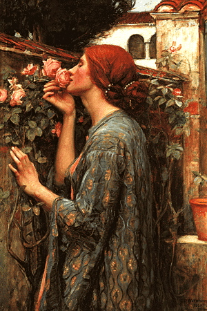
In a set of notecards, a reproduction of a sensuous painting, The Soul of the Rose (1908) by John William Waterhouse:

(#1)

The woman is smelling the rose, but she’s close to kissing it, close to treating it as a romantic partner (in which case the rose is a  symbol of the lover’s mouth). Other, more carnal, interpretations are available to modern audiences, for whom the rose can serve as a symbol of either the vagina or the anus.

But first, on Waterhouse and this work. From Wikipedia:

John William Waterhouse (born between January and April 1849; died 10 February 1917) was an English painter known for working in the Pre-Raphaelite style. He worked several decades after the breakup of the Pre-Raphaelite Brotherhood, which had seen its heyday in the mid-nineteenth century, leading him to have gained the moniker of “the modern Pre-Raphaelite”. Borrowing stylistic influences not only from the earlier Pre-Raphaelites but also from his contemporaries, the Impressionists, his artworks were known for their depictions of women from both ancient Greek mythology and Arthurian legend.

And from the beginning of an extended analysis of the painting:

Unlike a large proportion of Waterhouse’s other work, The Soul of the Rose is not a scene taken from a famous or ancient tale of love. Instead it is a study of a woman in a garden thought to be based on the work of Alfred Lord Tennyson. It’s important to keep in mind the themes of many of Waterhouse’s other works though, as similar themes of lost or unrequited love resonate in this picture.

Romance and Sensuality: Waterhouse often incorporated a great sense of sensuality in his women, whether in the form of naked flesh or simply a delicate look. Restrained sexuality and longing for an invisible love are key themes in The Soul of the Rose and the artist portrays the woman in the picture without any obvious sexuality, but her position against the wall and her delicate hand indicate subtle sensuality.

Victorian Values: Many of Waterhouse’s paintings are very telling of the place women had in society during his time. Victorian Britain was, for women, a place where for the first time, they started to be politically active and were able to vote and had other political rights that they had previously been denied.

Many of Waterhouse’s women are trapped or imprisoned and he seems fascinated by the idea of a woman who is powerful yet restrained. This may have been what he observed with women with high public profiles during his lifetime. The Soul of the Rose is no exception to this, as the woman is shown against a brick wall, her pleasure is nature and her thoughts of a love that was.

The rose — in particular, in the form of a rosette — appears frequently as a carnal symbol in pornographic writing, sometimes standing for the vagina but very frequently for the anus. On the rosette:

A rosette is a round, stylized flower design, used extensively in sculptural objects from antiquity. Appearing in Mesopotamia and used to decorate the funeral stele in Ancient Greece. Adopted later in Romaneseque and Renaissance, and also common in the art of Central Asia, spreading as far as India where it is used as a decorative motif in Greco-Buddhist art.

The rosette derives from the natural shape of a rosette in botany, formed by leaves radiating out from the stem of a plant and visible even after the flowers have withered. The formalised flower motif is often in carved in stone or wood to create decorative ornaments for architecture and furniture. A common motif in metalworking, jewelry design and the applied arts at the intersection of two materials, or to form a decorative border. (Wikipedia link)

Rosettes are commonly used for awards, ribbons, and recognitions. Here’s an elaborate architectural example:

(#2)

On to anal rosettes. Many examples, from both straight and gay porn writing. One of each:

His finger fucked back and forth for a few more moments before he pulled it out and positioned his cock at her rosette. She pushed back as best she could as he pressed forward, and she winced as his cock popped past her sphincter and into her ass. (link)

I pulled a condom from my pocket and slipped it over my cock. Kneeling behind him, I positioned the tip of my cock against his rosette. The condom was lubricated; Rafe wasn’t. (link)

And from AZBlogX, on image #6 in this posting:

from the Michael Lucas raunch/kink archives, this ad for a feature on assholes as a fetish or paraphilia (most gay men appreciate butts, but only some are deeply moved by contemplating assholes), with hard-working pornstar Adam Killian showing off (on a hunky buddy) the object of this specific desire [photo here, with the caption:]

THE EXEMPLARY ASSHOLE
Ed’s perfect
Rosette wins gold
Medals at the
State Fair.

A very careful composition. Note especially the cleft just above the asshole paired with the one in the lower back, and the role Killian’s face and spread hand play in the organization of the picture. (The star within the O of ASSHOLES matching the anal rosette is crude, but then how much subtlety could you ask for in a flick about fuckholes?)

This brings me, of course, to Jean Genet’s The Miracle of the Rose, in which anal intercourse figures prominently:

The Miracle of the Rose (in French: Miracle de la rose) is a 1946 book by Jean Genet about experiences as a detainee in Mettray Penal Colony and Fontevrault prison – although there is no direct evidence of Genet ever having been imprisoned in the latter establishment. This autobiographical work has a non-linear structure: stories from Genet’s adolescence are mixed in with his experiences as a thirty-year-old man at Fontevrault prison. At Mettray, Genet describes homosexual erotic desires for his fellow adolescent detainees. There is also a fantastical dimension to the narrative, particularly in Fontevrault passages concerning a prisoner called Harcamone who is condemned to death for murder. Genet idolises Harcamone and writes poetically about the rare occasions on which he catches a glimpse of this character. Genet was detained in Mettray Penal Colony between 2 September 1926 and 1 March 1929, after which, at the age of 18, he joined the Foreign Legion. (Wikipedia link)

And from there to Querelle de Brest:

Querelle of Brest (French: Querelle de Brest) is a novel by the French writer Jean Genet. It was first published anonymously in 1947 and limited to 460 numbered copies. It is set in the midst of the port town of Brest, where sailors and the sea are associated with murder, and its protagonist is Georges Querelle. The novel formed the basis for Rainer Werner Fassbinder’s last film, Querelle (1982).

The notorious poster for the film:

(#3)

Outrageously phallic. There are other sexy posters for the film, but none this extreme. The most famous, though, is Andy Warhol’s:

(#4)


More Asterixions (with Warhol)

$
0
0

On AZBlogX, a third installment of Asterixions — male photography or other visual art amended by the addition of captions (by me) and Asterix stickers.  Fourteen in this set: 3 using Howard Roffman photographs, one with a Benno Thoma, 2 Michael Rehs, 3 Bel Amis, and — new in the series — 5 with Andy Warhol images of men (in various media).

The tone of the background images varies considerably. The first (Roffman 26) is both sweetly romantic and sexy. The Bel Ami images are in-your-face glossy porn poses. And of course the Warhols are all over the map.

Not for the kiddies or the sexually modest.


Sheepish notes

$
0
0

Following on my posting on une bergère allemande, three notes: on the Folies Bergère; on shepherd vs. sheepherder; and on the cultural role of shepherds and shepherdesses.

The Folies Bergère. From Wikipedia:

The Folies Bergère … is a cabaret music hall, located in Paris, France.

Established in 1869, the house was at the height of its fame and popularity from the 1890s’ Belle Époque through the 1920s’ Années folles. The institution is still in business, and is always a strong symbol of French and Parisian life.

… It opened on 2 May 1869 as the Folies Trévise, with fare including operettes, opéra comique (comic opera), popular songs, and gymnastics. It became the Folies Bergère [the Bergère Follies] on 13 September 1872, named after a nearby street, the rue Bergère (“bergère” means “shepherdess”).

What I don’t know is how the rue Bergère got its name.

Shepherds and sheepherders. From OED2:

shepherd: 1. a. A man who guards, tends, and herds a flock of sheep (grazing at large); usually one so employed for hire; or one of a pastoral people who herds (his own) sheep, goats, etc. [from Old English on]

b. Applied to the rustic personages of pastoral poetry. Hence, in poetry more or less adopting the pastoral convention, formerly often used to designate the writer and his friends or fellow-poets. [first cite 1591]

shepherdess: A female shepherd; a woman or girl who tends sheep; also fig. Also in pastoral poetry (see shepherd n. 1b). [first cite 1532]

sheep-herder:  U.S. one who herds sheep in large numbers in unfenced country. [first cite 1872]

These OED entries haven’t been revised for quite some time and are no longer entirely accurate. The OED has a shepherd as a man; NOAD2 says “person”, recognizing that shepherd can be gender-neutral. And I’m not sure that sheep-herder (now more often sheepherder) is now exclusively American.

In any case, shepherd and sheepherder are not entirely interchangeable. Sheepherder doesn’t have the literary associations of shepherd, and (in line with the OED‘s entry) sheepherder suggests larger flocks than shepherd. Sheepherders are likely to have a dirtier, more difficult job than shepherds; think Basque sheepherders and the young men of Brokeback Mountain.

A note on the -herd of shepherd, goatherd, etc. From OED2 again:

A keeper of a herd or flock of domestic animals; a herdsman. Now usually with word prefixed, as cowherd, swineherd, but in Scotland and north of England still a common word for shepherd. [in Old English]

The pastoral tradition. From Wikipedia:

A shepherd …, or sheepherder, is a person who tends, feeds, or guards flocks of sheep.

… Shepherding is among the oldest occupations, beginning some 6,000 years ago in Asia Minor. Sheep were kept for their milk, meat and especially their wool.

… In popular culture: The shepherd, with other such figures as the goatherd, is the inhabitant of idealized Arcadia, which is an idyllic and natural countryside. These works are, indeed, called pastoral, after the term for herding. The first surviving instances are the Idylls of Theocritus, and the Eclogues of Virgil, both of which inspired many imitators such as Edmund Spenser’s The Shepheardes Calender. The shepherds of the pastoral are often heavily conventional and bear little relation to the actual work of shepherds.

Shepherds and shepherdesses have been frequently immortalized in art and sculpture. Among the best known is the neoclassical Danish sculptor Bertel Thorvaldsen’s Shepherd Boy with Dog.

… The shepherd, in such works, appears as a virtuous soul because of his living close to nature, uncorrupted by the temptations of the city.

Two artistic representations. An idealized shepherdess, in an 1889 painting by William-Adolphe Bouguereau:

(#1)

And an idealized shepherd boy in a sculpture by Bertel Thorvaldsen:

(#2)


Joe Boys

$
0
0

(Not about language.)

In my postcard queue yesterday, one by illustrator Joe Phillips:

Joe Phillips (born February 13, 1969) is an American artist, known for his mainstream comic book art and for his work depicting his views of gay life. He currently lives in San Diego, California. (Wikipedia link)

Phillips is the creator of the Joe Boy — young, fit, hung, playful, celebratorily gay, and highy sexed. Often found on California beaches, very often in groups of guys, just hangin’ out or horsin’ around.

Two examples:

(#1)

(#2)

He does a great many drawings of men kissing, sometimes in public places, as here:

(#3)

And also solo shots of men displaying their bodies, as here:

(#4)

There are plenty of penises in his drawings (not illustrated here). [But now I've posted five dick-displaying drawings on AZBlogX.]

In addition to his Joe Boy work and his comic-book work (mostly superheroes), Phillips also illustrates books (typically on gay subjects) — for instance The Joy of Gay Sex (3rd ed.). Here’s more kissing, from Joy:

(#5)


Magritte at MOMA

$
0
0

(Mostly about art rather than language.)

In the September 23rd New Yorker, a review by Andrea Scott, “Strange Days: MOMA refreshes the image of the Surrealist René Magritte”, beginning:

René Magritte was a pop-culture meme years before there was an Internet. In 1951, when CBS aired a new logo—a stylized eye hovering in a cloud-clotted sky—it bore an uncanny resemblance to his painting “The False Mirror” (1928). (The sky was later removed by the network.) Over the years, Magritte’s art has been hijacked for designs ranging from the Beatles’ record label to a Volkswagen ad to a bowler-hat light fixture. The Belgian Surrealist, who died in 1967, at age sixty-eight, is still going viral: in April, an anonymous artist started a Tumblr called Super Magritte, reimagining the artist’s works as 8-bit designs by Nintendo. In one case, the locomotive that floats indelibly in the fireplace of the painting “Time Transfixed” (1938) is replaced by Super Mario’s slow-moving bullet.

Magritte’s enduring popularity has edged his once shocking imagery into the realm of cliché. But his radical use of language and his transposition of the banal and the unnerving set a precedent. Would the enigmas of Jasper Johns’s flags or Ed Ruscha’s deadpan pairing of image and text have been conceivable otherwise? Magritte, who dressed like a banker and was known to paint at his dining-room table, saw himself as a “secret agent” in the war on bourgeois values. He once said of his mission, “Too often by a twist of thought, we tend to reduce what is strange to what is familiar. I intend to restore the familiar to the strange.’’

New Yorkers can recapture that strangeness in “Magritte: The Mystery of the Ordinary, 1926-1938,” at MOMA (co-organized with the Art Institute of Chicago and the Menil Collection) [Sept. 28 – Jan. 12]. The exhibition focusses on a dozen watershed years, starting with works that Magritte made for his first solo show, in Brussels — the reviews were not great, but they established him as Belgium’s only Surrealist and prompted him to move to the outskirts of Paris. There, he had a furiously productive three years (he made more than a hundred works in 1928 alone), but returned home in 1930, after the stock-market crash. The show ends in 1938, the year Magritte said, in a now famous lecture, “Surrealism claims for our waking life a freedom similar to that which we have in our dreams.”

Earlier on Magritte on this blog: “Magritte” on 7/9/12 (with parodies); “More Magritte” on 7/21/13.  And a bonus: a strange work of Magritte’s, a sort of visual portmanteau entitled Invention:


Male nudes

$
0
0

(Not much about language — mostly art and male bodies.)

Opened last week at the Musée d’Orsay in Paris.

From the Daily Beast on the 25th, “ ‘Masculin/Masculin,’ a Retrospective of Male Nudity in Art, Opens in Paris” by Sarah Moroz:

“Why had there never been an exhibition dedicated to the male nude until the Nackte Männer at the Leopold Museum in Vienna last year?” speculates the opening panel for a new exhibition, Masculin/Masculin—a sweeping history of male nudity in art—which opens at the Musée d’Orsay in Paris this week.

Why indeed. Female nudity is so omnipresent in art — and seemingly in every other media contex — that, as a society, we’re inured to a woman showing off her body in its entirety. But the male nude, by contrast, has a tendency to go raunchy fast. (An art historian friend was quick to rechristen this exhibit Dicks, Dicks, Dicks.) The Musée d’Orsay seemed to sense this, and thus was swift to state, as a counteroffensive, that: “We must distinguish above all between nudity and the nude: a body simply without clothes, that causes embarrassment with its lack of modesty, is different from the radiant vision of a body restructured and idealized by the artist.”

With this directive in mind, the Masculin/Masculin exhibit showcases more than two centuries’ worth of depictions of male nudes, subcontracting the topic into different thematic strata related to religion, mythology, athleticism, homosexuality, and shifting notions of manliness. Without adhering too strictly to chronology, it includes artists as diverse as Jacques-Louis David, Gustave Moreau, David Hockney, Edvard Munch, Francis Bacon, Robert Mapplethorpe, and Ron Mueck.

I posted in January on the Leopold Museum’s exhibition — first on AZBlogX (in “Dick aversion”, with plenty of illustrations), then on this blog (in “Horror of the penis”).


Nobelist Alice Munro

$
0
0

Much of the news recently has been dire, but in the midst of all this came the Nobel Prize announcements, many to people associated with Stanford (two laureates currently on the Stanford faculty: Thomas Südhof in Physiology or Medicine and Michael Levitt in Chemistry). And then there’s the wonderful news that Alice Munro is the laureate in Literature.

From Michiko Kakutani’s piece in the NYT yesterday, “Master of the Intricacies of the Human Heart: Alice Munro, Nobel Winner, Mines the Inner Lives of Girls and Women”:

Alice Munro, named on Thursday as the winner of the 2013 Nobel Prize in Literature, once observed: “The complexity of things — the things within things — just seems to be endless. I mean nothing is easy, nothing is simple.”

That is also a perfect description of Ms. Munro’s quietly radiant short stories — stories that have established her as one of the foremost practitioners of the form. Set largely in small-town and rural Canada and often focused on the lives of girls and women, her tales have the swoop and density of big, intimate novels, mapping the crevices of characters’ hearts with cleareyed Chekhovian empathy and wisdom.

Fluent and deceptively artless on the page, these stories are actually amazingly intricate constructions that move back and forth in time, back and forth between reality and memory, opening out, magically, to disclose the long panoramic vistas in these people’s lives (the starts, stops and reversals that stand out as hinge moments in their personal histories) and the homely details of their day-to-day routines: the dull coping with “food and mess and houses” that can take up so much of their heroines’ time.

Ms. Munro’s stories possess an emotional amplitude and a psychological density that stand in sharp contrast to the minimalistic work of Raymond Carver, and to Donald Barthelme’s playful, postmodernist tales.

Truly luminous writing, but as Kakutani says, deceptively artless on the page. I’ve admired her stories for years.


Logos

$
0
0

From the New York Times Magazine on Sunday the 13th, “Who Made That Android Logo?” by Pagan Kennedy:

Irina Blok may have drawn one of the most recognized logos in the world, but her association with the green Android has not made her famous.

… The Android logo was born three years earlier, when Blok worked as a designer at Google. As Google prepared to endorse the Android software platform for mobile devices, Blok and her design-team colleagues were told to create a look for the software — something that consumers could easily identify. The logo, she was told, should involve a robot, and so she studied sci-fi toys and space movies — anything that might help her create a character. In the end, she took inspiration from a distinctly human source: the pictograms of the universal man and woman that often appear on restroom doors. She drew a stripped-down robot with a tin-can-shaped torso and antennas on his head.

While Blok worked on her design, she and her colleagues agreed that the logo, like the software, should be open-sourced. “We decided it would be a collaborative logo that everybody in the world could customize,” she says. “That was pretty daring.” Most companies, of course, defend their trademark from copycats, and million-dollar lawsuits have been filed over the rights to corporate insignia. This one would remain free.

In the years since, the Android logo has been dressed up as a ninja, given skis and skateboards and even transformed into a limited-edition Kit-Kat bar. Blok (who is now creative director at Edmodo, a social network for students and teachers) says that creating the logo was like raising a child: “You give a life to this individual, and then they have a life of their own.”

A display with the original (at the top) plus a selection of variants:

(#1)

(I’m especially fond of row 1 #4, the pointy-headed boss from Dilbert.)

Trademarks and copyrights for logos are an issue for me, since I incorporate so many in my collages (search this site for “collage”), and I suspect I’m often skirting the law.

There’s been a movement to continue extending copyright for years and years — in particular the U.S. Copyright Term Extension Act of 1998, which extended copyright to the life of the author plus 70 years. (No doubt Disney will eventually seek another extension.) Here’s a logo representing opposition to the CTEA, using a reference to the pejorative characterization of it as the “Mickey Mouse Protection Act”:

  (#2)

The logo combines the NO X red diagonal slash –

(#3)

the Mickey Mouse ears –

(#4)

the copyright symbol ©, and the infinity sign ∞.


Viewing all 102 articles
Browse latest View live